February 26, 2008
February 23, 2008
HOSOYA SCHAEFER Architects (Part II) - Engadin Airport
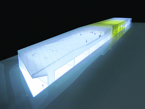
On February 12th it was announced that HOSOYA SCHAEFER Architects have won the first prize in the competition to design the new buildings for the Engadin Airport near St. Moritz. The competition was started last year and should satisfy the need of a growing airport, which is highest situated in Europe with 1707 (5600ft), for improvements and reorganization of it's infrastructure. The current airport was bought by the Canton Graubünden from the Army in 2004 and was consequently transformed into a civilian airport. Topping 17'000 flight movements a year, this airport has established itself as an important infrastructure to the remote region in the Swiss Alps. Stationed here are gliders, helicopters and five airlines that offer charter flights to Europe and elsewhere. But probably the most important effect this airport has for its region is the possibility that guests get high accessibility to the luxurious residencies, hotels and ski-resorts of the famous vacationing spot of St. Moritz. This region that heavily depends upon tourism, has gone to great lengths to expand offers to the high class segment, which this extension and redevelopment of the airport marks the peak so far.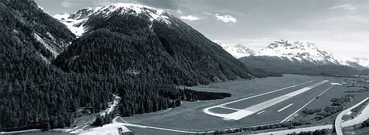
About the project
(quoted from the press release)
In addition to operational facilities, the program includes a large restaurant, a hotel, facilities for events and hangars for aircrafts, helicopters and gliders.
The winning project titled “Sungate” proposes a monolithic building that combines all the different functions into one long shape creating a clear edge to the airfield. In the center of the building the hangar for aircrafts is combined with a large three-storey high lobby space creating a generous light filled gate mediating between the airfield and the valley. The lobby acts as a programmatic hinge that
allows for combining the different areas of the building into multiple scenarios of use. Thermal solar collectors on the roof over the hangar are feeding large water tanks that store solar energy while the building itself is built as a light construction, a hybrid structure combining aluminum and wood. With
the addition of a wood pellet furnace, the building is planned to be heated to 100% by renewable energy. With a large south-oriented terrace, various additional functions and the central lobby, the airport will become a destination for locals and international guests alike. The design was developed in collaboration with Mitsuhiro Kanada / Arup London for structure and Waldhauser Haustechnik AG,
Basel for MEP services.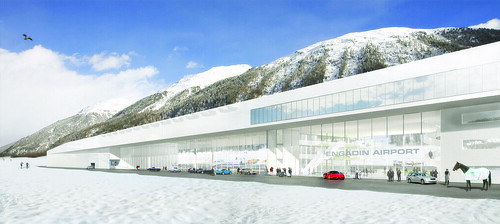
What the jury had to say
(quoted and translated from the press release)
The exterior of the main building is convincing through its restraint and timeless elegance. The generous and centrally located foyer and lobby creates a gateway to the Engadin, not only for the village of Samedan but also for the arrival hall for the passangers. A transparent façade underlines the experience of aviation for the passangers and visitors alike. The capable organization of the single elements of the building allows adjustments for seasonal fluctuations in occupancy and passanger count due to a flexible spatial concept, the interior can adapt to the necessities of the offered services.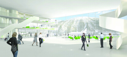
Conclusion
Obviously designing an airport offers certain challenges beyond the programmatic requirements due to the fact that additional to bulding codes, the airport has to adhere to whole different set of rules, those of the federal aviation agency (BAZL - Bundesamt für Zivilluftfahrt). Those constraints have limited the placement of a new building for the Engadin Airport, which is supposed to replace the old hangars and buildings, some still from the time this was an army airport.
This begs the question how to combine hangars, arrival and departure halls, and other programm parts? The result is as obvious as it is logic at the same time, a horizontal slab with programmatic segments. The simplicity of this diagram might be striking in it's clear structuring, the architectural representation however would create real challange in order to accomodate all the beforehand mentioned.
From my point of view, nowadays a common concept for airports is that the public areas and buildings are either designed or covered under an appealing skin that wraps around the vast open spaces that first Norman Fosters' Stansted Airport near London declared and defined almost 20 years ago as the quasi-standard of airport design. As a byproduct these sometimes beautiful boxes have some less appealing siblings that house functional elements for an airport, such as technology, hangars or various other elements, that are efficiently organized but not necessarily designed. An exception in Switzerland might be the new Terminal E by AGPS and the adjacent utility building that features a wooden cladding and it's height is declining to signify a change in what is stored inside, however the two buildings are still separated.
My point would be that the proposal by HOSOYA SCHAEFER Architects was able to include representational elements of the design along with functional parts and distribute them under a combining roof. In this case the roof is a structure that defines the upper thickness of this "modernistic slab", which OMA is using recently but only figuratively. This structure which allows the different functional and programmatic parts to be connected with, was again developed like on the previous project I featured on dialog, in collaboration with Mitsuhiro Kanada of ARUP in London.
What is striking is the sectional melange of the aforementioned diagram, where the structure that covers the hangars is activated on top with a visitors terrace. This physical overlapping of the program is also enhanced by the semi-transparent façade that wraps around the more technical spaces and the public spaces alike.
The gorgeous renderings are certainly very seductive, but the also show this often contradicting desire to reveal the inside towards the outside and at the same time open it self, in this case towards the panorama of the Swiss alps.
Since such small airports function often differently than larger solely commercial airports, the building has to adapt accordingly, which also means to the certainly important high-end clientèle which I mentioned above. Thus the airport as itself is not only a built diagram but also a designed environment that as to have a lounge-like appeal but at the same time feel much more spacier and has to live up to the different user identification with the airplanes.
I think this proposal is rather successful in creating this inviting and friendly atmosphere, yet meet the expected demureness of this region. The gesture is clear and clean but offers the unexpected. It might actually live up to the high expectations, I am certainly already saving for my first "flight" to the Engadin.
Images © HOSOYA SCHAEFER Architects,
More Images and info, with project credits: here
Press Release of the Airport Engadin: here (doc)
Project Text of HOSOYA SCHAEFER Architects: here (pdf)
Eingestellt von
Sasha Cisar
um
9:44 PM
3
Kommentare
![]()
HOSOYA SCHAEFER Architects (Part I) - Stadtraum HB Baufeld E
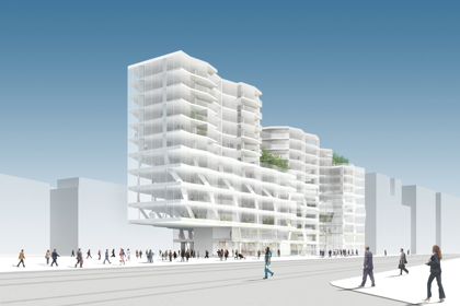
Last year the city of Zurich approved a masterplan by Kees Christianse of KCAP for the so called Stadtraum HB, a redevelopment plan of an area behind the main train station (Hauptbahnhof) in the center of Zurich. Most of the buildings belong to the Swiss Federal Railways (SBB) and have been included with some adjacent parts, along the former post building. The total area of 78'000m2 will be transformed into a mixed-use neighboorhood with 400 apartments and approximately 5000 will be working there in future. Additionally some 2000 students of the PHZ (College of Education) will be situated there.
There are nine lots and for each a competition is held. According to the masterplan this current lot "E" (Baufeld E) has to have a minimum of 40% housing and can have a maximum of 40m height.
The image above is one of the projects of the competition for the lot "E" and was designed by HOSOYA SCHAEFER Architects.
They say the following on their website about their project:
"The proposal layers the functions horizontally resulting in deep floor slabs that are lit with internal courts and light wells. Since all the layers have different spatial and structural requirements a flexible hexagonal module has been adopted. Each hexagon is supported by three “ribbon columns” that can change orientation relative to the module and move from corner to corner. This allows for smooth adjustments between floors without expensive and inefficient transfer structure. In the front area of the building the ribbon columns run diagonally through the floors and together with vertical tension rods for a large truss supporting the cantilevered front of the building.
The three housing types are separated by roof gardens providing a variety of spaces, public and private, on the upper floors."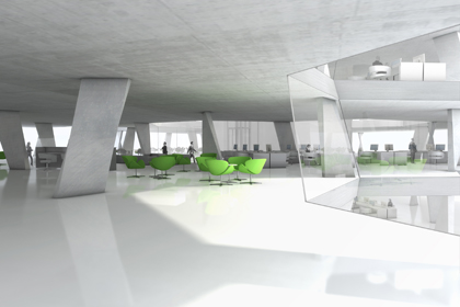
I had to share with you the two gorgeous images and on their website you can find more and some plans of the project. Admittedly I have worked in this office for a short while, unfortunately not on this project though. I haven't seen the results of the competition yet and to date I was not able to find out when they are being published, however I think it's worth looking at this project for instance, because it offers a rather fresh approach on the constraints, programatical and formal, that are imposed by the competition or the rather conservative architectural establishment in Zurich. It makes you wonder, how to be expressive without appearing so, in a sense subversive.
This project is based on a cell-like structure that horizontally organizes space (and program) and vertically works to load bearing. The huge cantilever is ARUP approved and creates a covered urban square. Admittedly the images look are seductive, what I can't find out, due to lack of material available on the project so far, is the distribution of the program. I assume the housing is located on the building's south side while the north side, the base and lower parts of the building are offices. From south the building appears to break down into multiple parts while it maintains a visually dominant and representational head on the north side, along with it's public program.
As much as I like the images, the real problem here is, that the surrounding lot's either had or will have competitions for future buildings, but mostly they haven't been defined yet, therefore there is no real context to this project. It is confined to function within strict rules, but imposed by the master plan and it's interior organization.
Final judgment therefore is nearly impossible, however I hope the winning project for the lot "E" in this case will be equally progressive with it's proposed architecture, as this building suggests it might be.
Images © HOSOYA SCHAEFER Architects,
Images and plans: here
Masterplan (PDF in German): here
Eingestellt von
Sasha Cisar
um
12:17 AM
3
Kommentare
![]()
February 13, 2008
Architecture in Europe - Overview Pt. 2
Here a map of the various sites I will feature in the upcoming posts.
View Larger Map
Eingestellt von
Sasha Cisar
um
12:34 AM
0
Kommentare
![]()
February 11, 2008
Architecture in Europe - Overview Pt.1
Over the course of the next few days I will finally resume my posting. The emphasis of this batch of posts is new and contemporary architecture around Europe and especially in Switzerland. I have plethora of new images which I would like to share with my readers.
Take with me a tour of Chur and see some interesting redevelopment near the train station in the city center, which has completely changed during the last five years. An exclusive tour of the House Gartmann will show you how one can build a house with only concrete and no insulation!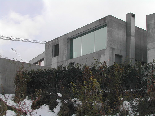
Then we will go further down the Rhine to the shores of the Lake Constance where one can find an excellent example of how swiss architects are trying to go beyond the typical box.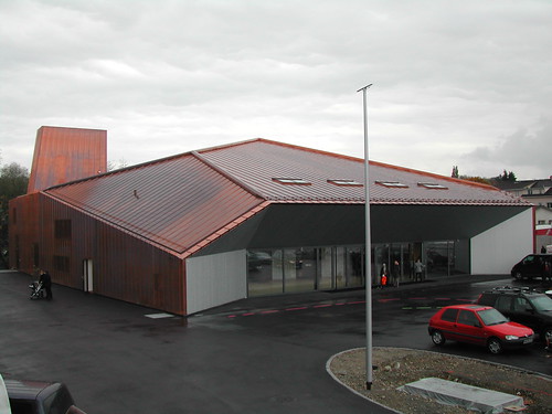
Similar, who knows, but certainly equally expressive in it's form is the new Agora by UN-Studio. I was able to get some images of this new building which one can find within a rather peculiar setting.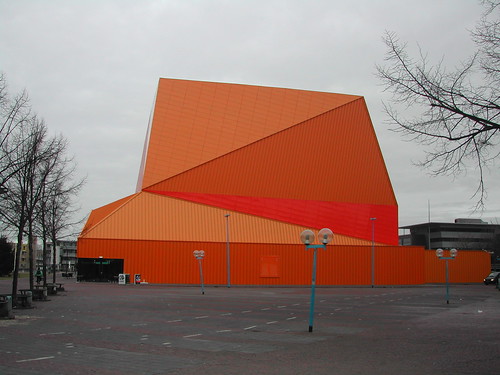
Talking about form and contemporary new public places, we have to consider the critically acclaimed Casa de Musica by OMA. I think you will be able to get a very good glimpse by the dozens of images I was able to shoot, why this building finds acceptance even between the more classical architects.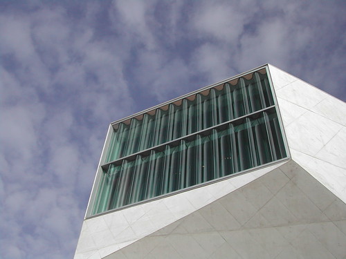
Another interesting building is the Mercedes-Benz Museum in Stuttgart, it attracts thousands of visitors each day, including myself late last year. We shall examine why this is probably one of the most successful UN-Studio buildings so far.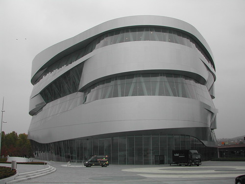
Also at the Lake Constance, but in Austria we find the famed Kunsthaus by Peter Zumthor. Recently there was an exhibit on his work with huge models that one could even enter.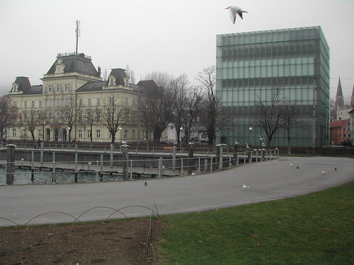
Going back to Switzerland we have to look at the recent installation by Olafur Eliassion and how he yet again attacked the notion of a house and it's particular interiority.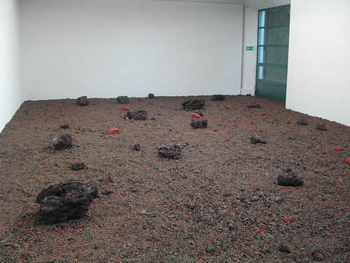
After finally revisting my birth place I would like to share some gorgeous images of modernist church near the Lake Lucerne.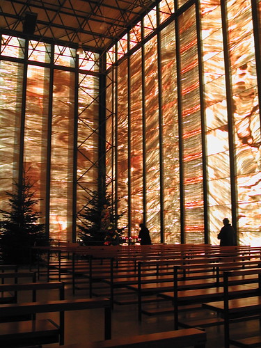
Last but not least, we will go to Basel and it's sourroundings to admire some of the work of Herzog & De Meuron.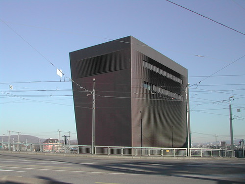
Finally we will try to understand the shift of the formal vocabulary in the work of Herzog & De Meuron which was most probably consummated in last years and eventually reached their home town in a mysterious manifestation: a yet unpublished house.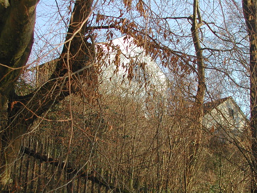
Naturally there is much more to see, images, observations and some other very special features to look forward to.
SC
Eingestellt von
Sasha Cisar
um
6:09 PM
3
Kommentare
![]()

