HOSOYA SCHAEFER Architects (Part II) - Engadin Airport

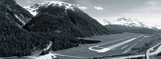
On February 12th it was announced that HOSOYA SCHAEFER Architects have won the first prize in the competition to design the new buildings for the Engadin Airport near St. Moritz. The competition was started last year and should satisfy the need of a growing airport, which is highest situated in Europe with 1707 (5600ft), for improvements and reorganization of it's infrastructure. The current airport was bought by the Canton Graubünden from the Army in 2004 and was consequently transformed into a civilian airport. Topping 17'000 flight movements a year, this airport has established itself as an important infrastructure to the remote region in the Swiss Alps. Stationed here are gliders, helicopters and five airlines that offer charter flights to Europe and elsewhere. But probably the most important effect this airport has for its region is the possibility that guests get high accessibility to the luxurious residencies, hotels and ski-resorts of the famous vacationing spot of St. Moritz. This region that heavily depends upon tourism, has gone to great lengths to expand offers to the high class segment, which this extension and redevelopment of the airport marks the peak so far.
About the project
(quoted from the press release)
In addition to operational facilities, the program includes a large restaurant, a hotel, facilities for events and hangars for aircrafts, helicopters and gliders.
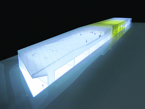
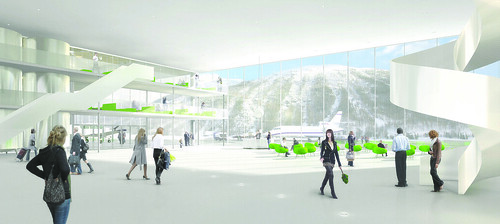
The winning project titled “Sungate” proposes a monolithic building that combines all the different functions into one long shape creating a clear edge to the airfield. In the center of the building the hangar for aircrafts is combined with a large three-storey high lobby space creating a generous light filled gate mediating between the airfield and the valley. The lobby acts as a programmatic hinge that
allows for combining the different areas of the building into multiple scenarios of use. Thermal solar collectors on the roof over the hangar are feeding large water tanks that store solar energy while the building itself is built as a light construction, a hybrid structure combining aluminum and wood. With
the addition of a wood pellet furnace, the building is planned to be heated to 100% by renewable energy. With a large south-oriented terrace, various additional functions and the central lobby, the airport will become a destination for locals and international guests alike. The design was developed in collaboration with Mitsuhiro Kanada / Arup London for structure and Waldhauser Haustechnik AG,
Basel for MEP services.
What the jury had to say
(quoted and translated from the press release)
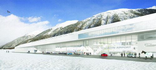
The exterior of the main building is convincing through its restraint and timeless elegance. The generous and centrally located foyer and lobby creates a gateway to the Engadin, not only for the village of Samedan but also for the arrival hall for the passangers. A transparent façade underlines the experience of aviation for the passangers and visitors alike. The capable organization of the single elements of the building allows adjustments for seasonal fluctuations in occupancy and passanger count due to a flexible spatial concept, the interior can adapt to the necessities of the offered services.
Conclusion
Obviously designing an airport offers certain challenges beyond the programmatic requirements due to the fact that additional to bulding codes, the airport has to adhere to whole different set of rules, those of the federal aviation agency (BAZL - Bundesamt für Zivilluftfahrt). Those constraints have limited the placement of a new building for the Engadin Airport, which is supposed to replace the old hangars and buildings, some still from the time this was an army airport.
This begs the question how to combine hangars, arrival and departure halls, and other programm parts? The result is as obvious as it is logic at the same time, a horizontal slab with programmatic segments. The simplicity of this diagram might be striking in it's clear structuring, the architectural representation however would create real challange in order to accomodate all the beforehand mentioned.
From my point of view, nowadays a common concept for airports is that the public areas and buildings are either designed or covered under an appealing skin that wraps around the vast open spaces that first Norman Fosters' Stansted Airport near London declared and defined almost 20 years ago as the quasi-standard of airport design. As a byproduct these sometimes beautiful boxes have some less appealing siblings that house functional elements for an airport, such as technology, hangars or various other elements, that are efficiently organized but not necessarily designed. An exception in Switzerland might be the new Terminal E by AGPS and the adjacent utility building that features a wooden cladding and it's height is declining to signify a change in what is stored inside, however the two buildings are still separated.
My point would be that the proposal by HOSOYA SCHAEFER Architects was able to include representational elements of the design along with functional parts and distribute them under a combining roof. In this case the roof is a structure that defines the upper thickness of this "modernistic slab", which OMA is using recently but only figuratively. This structure which allows the different functional and programmatic parts to be connected with, was again developed like on the previous project I featured on dialog, in collaboration with Mitsuhiro Kanada of ARUP in London.
What is striking is the sectional melange of the aforementioned diagram, where the structure that covers the hangars is activated on top with a visitors terrace. This physical overlapping of the program is also enhanced by the semi-transparent façade that wraps around the more technical spaces and the public spaces alike.
The gorgeous renderings are certainly very seductive, but the also show this often contradicting desire to reveal the inside towards the outside and at the same time open it self, in this case towards the panorama of the Swiss alps.
Since such small airports function often differently than larger solely commercial airports, the building has to adapt accordingly, which also means to the certainly important high-end clientèle which I mentioned above. Thus the airport as itself is not only a built diagram but also a designed environment that as to have a lounge-like appeal but at the same time feel much more spacier and has to live up to the different user identification with the airplanes.
I think this proposal is rather successful in creating this inviting and friendly atmosphere, yet meet the expected demureness of this region. The gesture is clear and clean but offers the unexpected. It might actually live up to the high expectations, I am certainly already saving for my first "flight" to the Engadin.
Images © HOSOYA SCHAEFER Architects,
More Images and info, with project credits: here
Press Release of the Airport Engadin: here (doc)
Project Text of HOSOYA SCHAEFER Architects: here (pdf)


hi
ReplyDeletewow this air port is awesome! do you have more photos ? please post them soon?
ReplyDeleteSo futuristic.
ReplyDelete