April 15, 2011
January 18, 2011
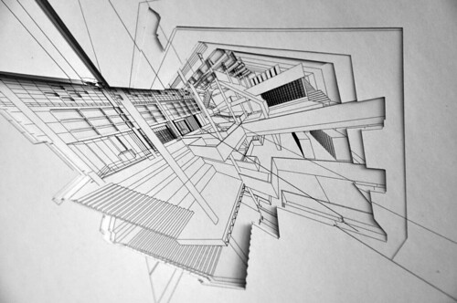
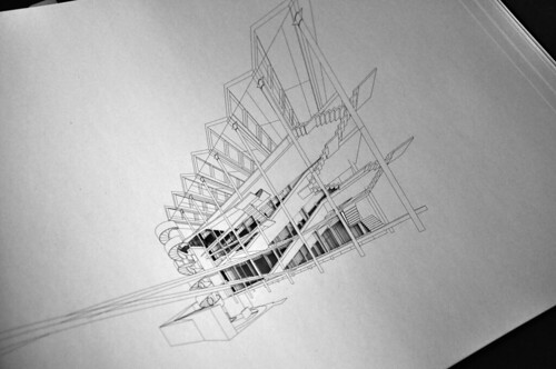
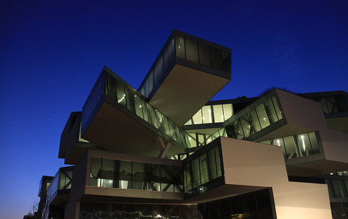
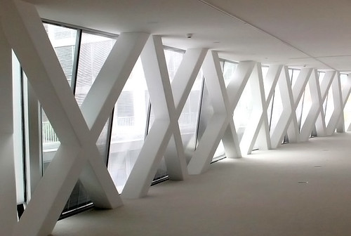
Actelion Business Center by Herzog & de Meuron near Basel
Dr. Jean-Paul Clozel, Chief Executive Officer of Actelion said: "After a three-year construction phase, we are delighted to be able to hand over the building to our employees. The architecture stands for innovation, openness and communication and thus symbolizes core values of our company." Jean-Paul Clozel added that "The new Business Center offers our employees an innovative, inspiring work environment."
Eingestellt von
Sasha Cisar
um
3:18 PM
9
Kommentare
![]()
January 12, 2011
Beyond Program - On Diagram in OMA and SANAA
In "Delirious New York" Koolhaas describes a metropolitan development that is parallel, almost an alternative reality, to the broader modernist narrative. The New York City grid, a repetitive scheme, allows for the city-block to articulate almost infinite iterations only limited by height and set-backs. That is conceptually similar to the relationship between the building and the façade which was separated by what Koolhaas in surrealist fashion refers to as lobotomy. That allows the façade to be a independently articulated and not refer to the interior. The latter however is therefore liberated to adjust to the function of the building. With the downtown Manhattan Athletic Club, the program in particular generates a very distinct interior, where each floor starts to react to the program. Consequently the section becomes more important than the plan. The section becomes a strategy how to differentiate program.
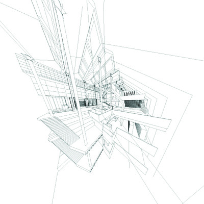
In Parc de la Vilette, Koolhaas and his Office OMA (Office for Metropolitan Architecture), the section literally became the new plan. They used the section of the Downtown Manhattan Athletic Club to create "zones of major programmatic categories". For Koolhaas the diagram is in fact an organizational and strategic tool for program, it is a diagram of program. In Supercritical, Eisenman would call it "Content is Form". The Cartier des Halles in Paris could be used as a good visualization of 'diagram of program'. A redevelopment of a traditional market turned shopping center and huge subway hub and exchange in the center of Paris, close by to the Centre Pompidou. Two diagrams explain the project, one highlighting the current programming. Another one which is the same, just with the difference that the programmatic stripes are altered to outline shapes that OMA inserted into the site for the reason to "overcome schizophrenia beaten underground existence and above ground inexistent". That is basically all you need to understand, to "read" the project, the model is just extra. Contrary to the Downtown Manhattan Athletic Club, the Jussieu Libraries project offered connected floors: "A simple stacking of floors, sections of each are manipulated to touch those above and below; all the planes are connected by a single trajectory, a warped interior boulevard that exposes and relates all programmatic elements". It could be regarded as a critical translation and progression from the Athletic Club. According the Jussieu project extends the urban experience, from the city into the building. Using the surrealist (Paranoid Critical Method), the building becomes the city's extension (like an additional limb). Through the continuous surface the building becomes an "urban scenario". The Royal Dutch Embassy could be regarded as further translation, where a interior circulation ramps up a "disciplined cube". Instead of warped surfaces like in Jussieu, the embassy features a more traditional sequence of corridors and stairs to which the program is attached to; the program becomes an 'extension' of the circulation.
Talking to the ARUP Japan's Mitsuhiro Kanada (who works at ARUP Japan and was in charge of structural engineering and design for several project from Zaha Hadid to SANAA and recently Toyo Ito's Metropolitan Opera in Taichung, Tawan) Sejima and Nishizawa, or SANAA, seem to continuously pursue to push the reduction of material properties to an absolute minimum. The Serpentine Pavilion in London, a structure from aluminum and steel was tweaked until the roof was only 2-3mm thin. Arup even developed tiny details to discharge rainwater, but in order to preserve the thinness, the rainwater became in inexistent or ephemeral wall of the structure.
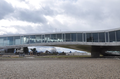
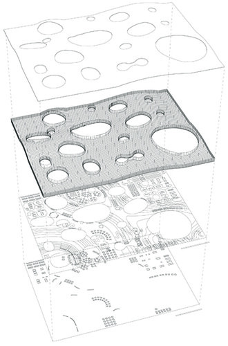
The Rolex Learning Center for the EPFL in Lausanne, which I described in a previous post, is a continuos slab, modest in appearance like a one story high office building, with the difference of an undulating surface, which causes the slab to lift itself and soaringly arch above ground. The President of the EPFL (which belongs together with the ETH Zurich to the ETH-Domain of the Swiss Confederation) Patrick Aebischer explained, that the university was seeking to replace the previous research and library building funded by the watchmaker Rolex with a new building that reflected a modern university campus, where students interact, exchange and learn from early in the morning to late at night. The building is what I would call a 'learning landscape' that sought to generate a creative environment that short-circuits traditional modes of learning. It becomes a new typology and contemporary architectural answer as to how working and learning can be designed and working. The 'line' of the wall is physically and functionally almost entirely immersed into the undulating landscape. Analyzing the building reveals that the program is merely a furnishing and large portions are empty. The diagrammatic quality of the plan is intensified through the diagrammatic programming. SANAA's diagram of aesthetic has overcome program. It is reduced to a tool of perception rather than experience. It appears we have arrived at a state which is beyond program.
Eingestellt von
Sasha Cisar
um
12:40 PM
4
Kommentare
![]()
Labels: architecture, Delirious New York, diagram, Jussieu Library, Koolhaas, Nishizawa, OMA, Rolex Learning Center, Royal Dutch Embassy, SANAA, Sejima
January 06, 2011
Herzog & de Meuron Tower for Basel II
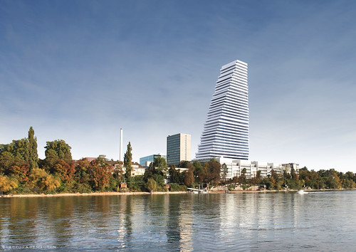
Two years ago the Pharmaceutical Company Roche, which headquarter is located in Basel, presented a high rise building by Herzog & de Meuron which would twist into Basel's skyline. The project was however abandoned by Roche, apparently because it conflicted with the company's program for that building. Roche continued to work with H&deM and on December 17th presented the "building 1" (Bau 1). It should offer 1900 workplaces and should replace the "Twist 2 Spirals". The company will seek building approval by the city. Roche's CEO says: "Roche needs a highrise office building in Basel. The spatial proximity of all the company's departments - R&D, production, marketing and directorate - is crucial for a successful cooperation. Therefore will want to recollect our 1800 employees which are currently scattered across the city and bring them back to the headquarter."
The building's color scheme is adapted to the existing at the Roche Campus and should be regarded as a continuation of the work of the architect Otto Salvisberg, who created the modernist buildings for Roche in the first half of the last century.
Along the said workspaces, a 500-seat auditorium, cafeteria and communication zones are planned.
The building will be 41 stories, approximately 175m, high and offer 76'000m2 space. Costs should be about 550million Swiss Francs. It should be an energy efficient Minergie building.
Via: Roche. Images here. Copyright © F. Hoffmann-La Roche Ltd.
Eingestellt von
Sasha Cisar
um
6:37 PM
9
Kommentare
![]()
New Basel by MVRDV
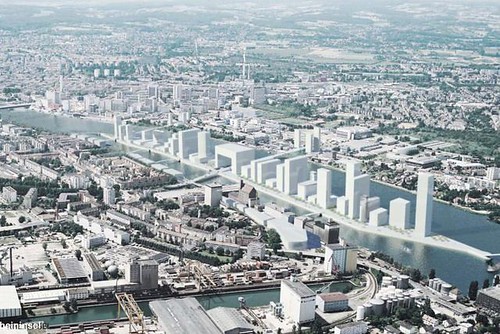
Coinciding with the opening of the IBA Basel 2020 (Internationale Bauaustellung, international building exhibition) the building department of the city of Basel presented "New Basel". Fritz Schumacher, the city planner of Basel explained that the Visualization made by MVRDV should show the possibility of a future development of Basel on a soon-to-be brownfield harbour on the Rhine. The small strip has the potential to totally alter the skyline of the city. A vision for 2020, to include housing, businesses, the city could reclaim a former harbour and industrial area in the corner bordering Germany and France. The harbour which is used to load and unload containers shipped and received from Rotterdam is supposed to be moved to offer more space. The moving of the harbour obviously is the requirement for the city to be able to start developing the lot, which is still covered by railroads and storage buildings. MVRDV together with local planners Marin Josephy and Philippe Cabane suggested to open up this small peninsula, to allow the Rhine to flow and generate a small island. The development also should not stop at the border but include the towns of Weil, Germany, and Huningue, France. According to the city planner Schumacher this future Klybeck island, should become part of the IBA development for Basel.
Via: http://www.nzz.ch/nachrichten/politik/schweiz/new_basel__eine_schweizer_hafen-city_1.9002998.html
http://www.tagesanzeiger.ch/schweiz/standard/Manhattan-mitten-in-Basel/story/22884814
https://twitter.com/#!/MVRDV
Eingestellt von
Sasha Cisar
um
6:23 PM
0
Kommentare
![]()
January 05, 2011
January 03, 2011
On the Internet as the Locus of the Digital Culture
I suppose this is where I have to take issue. My usage of the metaphor would be to turn the sock inside out, where now the digital wraps around everything else.
Firstly I should mention, that with the digital, I mean the Internet and networking in general. We are in a state which is (still) beyond comprehension, because we have created something that is about to fundamentally change, well, many things, because if you cannot comprehend the extent of the phenomenon, it is difficult to assess how it will affect us, except with very particular examples. The Internet and the digitalization of our lives, is a phenomenon difficult to fathom, especially by people who are merely immersed in that "medium" and solely its users.
To illustrate my point I have to take a small excursus. People who were born in the seventies or the early eighties, have witnessed at a more or less young age the shift from a analog to a digital world. Where internet and networking was possible by a very few people, some would call it the elite others simply geeks, contrary to today, where even grandparents enjoy the grandchildren's trips via chat, webcam or blogs. This generation has actively witnessed the time before internet, or more precisely the World Wide Web, and the currents state. Which will become dominated by what are called the "digital natives", who from a very young age have experienced and used digital technology and thus have become proficient users.

(The Blur, Diller + Scofidio for the Expo.02, 2002, Yverdon-les-Bains, Switzerland; via: http://www.eikongraphia.com/)
The reason one has refer to very particular examples is, that the greater narrative has not been written yet and the small innocent examples can hint us at how to understand and begin to comprehend, what a fundamental change the internet and digital technology is. The digital natives are users of applications and highly designed tools, that are either tools satisfy individual desires and/or problems, or they offer a critical hybridization of not too many — but just enough — elements to maintain a simplicity of usage. This hybridization, inherent in smart phones or in particular the iPhone, is a manifestation of said hybridization. But in fact that does not mean anything else than networking/network-ability of single elements/tools that start working together as a compound entity (in other words a network, or straightforward the internet itself). The iPhone thus becomes an (hardware) extension of the internet so to speak. The digital natives are continuously using more such highly developed tools. The simpler (and easier, but at the same time cleverer!) the networked elements work together, the faster will they be adopted and used in favor to older, less networked tools and applications (-> AppStore).
This development in which the digital natives are immersed in, the previous generation is experiencing with a tad less immersion. The competence of using such networked tools is very high with the digital natives. Pretty much any pre-kindergardeners will without much hesitation take an iPhone and figure it out how to use it. It is interesting to observe an adult talking to his child, about having to install an app so she can play the piano on the iPhone. What an absurdity of abstract terms one might think, but in context and considering the level of immersion of the digital natives, such technological concepts and terminology one does not need to know about , in order to be able to use.
The cleverly networked and designed tools reduce knowledge to a negotiation of intuition in order to allow a smooth adaptation.
Now the previous generation firstly had to deal with inferior digital tools, that where far less intuitive and the "learning curve" was very difficult to master. Hence only a very few achieved this level of mastery and immersion exactly because there was no precedent. These individuals where exactly became the precedent for the digital native. A very elite part of such people where the early hackers, mostly benign in nature they simply spent lots of time working their way into this digital realm. Intuitive design of digital tools, simply means that they are accessible, they are open to use in manifold ways. Such doors the hackers had to find for themselves, they had to hack (type into the computer) a program, and application because there simply was none before. Obviously by far not everybody has been a hacker of the generation avant the digital natives, but surely the competence in terms of how the digital technology is made, comprised and how it works is higher, than simply knowing how to use it.
Professor Rolf Pfeiffer of the Artificial Intelligence (AI) Lab at the University of Zurich is researching toward the intelligence of the limbs. Contrary to Prof. Pfeiffer's research, in Japan for instance, robots as an application of artificial intelligence are centrally controlled by a computer, that steers all its functions, similar to our brain. However Prof. Pfeiffer argued and research in Biology has shown, that our brain in fact does not control every process, but certain reactions are subsidized, locally induced. His argument is that nowadays hardly a computer can achieve both, miniaturization of the computer and it's computing power can be combined in order to centrally command a robot it all it's complexities it is supposed to mimic human behavior - be artificially intelligent. Thus Prof. Pfeiffer breaks down the intelligence. How a limb is designed impacts it's function, thus less computing power is needed.
I am not an expert on AI research, but at least as a metaphor it could have value to my argument. The cleverly networked tools the digital natives use demand only a little intelligence to understand how they work, we can interact instantaneously and thus focus our intelligence on actually using them. The design is intelligent, thus we can relocate knowledge and intelligence to other things.
I have mentioned two generations, the digital natives, born at the end of the eighties to pretty much nowadays and beyond and the previous generation.
Where the latter had to painstakingly y acquire the competence in using digital technology, the former is immersed in digital technology that offers a plethora of intelligently designed (cleverly networked) tools and thus can focus on the application than onto "howto".
This rather long excursus should not have been in avid, but rather important to get to the next point. People in politics and those who are in charge of our societ(-ies)y are predominantly of that previous generation or even older ones. The consequence is, that the general understanding on what a profound meaning the internet has is fundamentally lacking. The questions that should be driving us, in order to understand what the immersion of the digital natives means and in more general terms the ubiquitous availability of information. Current developments in computer science and information technology are working with the notion of the "could", cloud-computing. Where information is no longer stored locally, but in the cloud, the internet. Much more than just a reiteration of the net-computer that Sun was advertising in the 1990's, this similar concept describes the cloud as omni-present entity, where I can access my stored information anywhere and anytime. Ubiquitous computing becomes the ubiquitous information, which is instantaneously available. There is only one precedent which comes to mind to this concept, our brain.
If you as a politician or policy maker have only a faint understanding and a vague notion what the digital and the internet is, how should you be able to define digital politics (policy, DIgitalpolitik)? How can you address such problems such as the digital divide? I think there is a cultural disconnect, which is unfortunately is difficult to describe and to anticipate how it will develop, except that it will further effect everything we do.
Certainly it is an important question to ask, that we perhaps should not offer all of our private information, that the government should not save our patient data on the internet. But what is the notion of privacy in a time, where the digital natives do not care firing away personal information on the internet. On the contrary, the information you disclose, the better will you be networked and the smoother applications work, individualized and adapted.
Such concepts and arguments can be repeated about pretty much everything, it seems we have to renegotiate everything.
This is neither solely a phenomenon at the end of industrialization, nor a contemporary sideshow. I would boldly suggest, that this hints at a new culture. Its locus is the internet,the cloud is too hard to locate, but ubiquity suggests placelessness.
Eingestellt von
Sasha Cisar
um
9:56 PM
2
Kommentare
![]()
