Showing posts with label architecture. Show all posts
Showing posts with label architecture. Show all posts
April 15, 2011
January 12, 2011
Beyond Program - On Diagram in OMA and SANAA
In "Delirious New York" Koolhaas describes a metropolitan development that is parallel, almost an alternative reality, to the broader modernist narrative. The New York City grid, a repetitive scheme, allows for the city-block to articulate almost infinite iterations only limited by height and set-backs. That is conceptually similar to the relationship between the building and the façade which was separated by what Koolhaas in surrealist fashion refers to as lobotomy. That allows the façade to be a independently articulated and not refer to the interior. The latter however is therefore liberated to adjust to the function of the building. With the downtown Manhattan Athletic Club, the program in particular generates a very distinct interior, where each floor starts to react to the program. Consequently the section becomes more important than the plan. The section becomes a strategy how to differentiate program.
In Parc de la Vilette, Koolhaas and his Office OMA (Office for Metropolitan Architecture), the section literally became the new plan. They used the section of the Downtown Manhattan Athletic Club to create "zones of major programmatic categories". For Koolhaas the diagram is in fact an organizational and strategic tool for program, it is a diagram of program. In Supercritical, Eisenman would call it "Content is Form". The Cartier des Halles in Paris could be used as a good visualization of 'diagram of program'. A redevelopment of a traditional market turned shopping center and huge subway hub and exchange in the center of Paris, close by to the Centre Pompidou. Two diagrams explain the project, one highlighting the current programming. Another one which is the same, just with the difference that the programmatic stripes are altered to outline shapes that OMA inserted into the site for the reason to "overcome schizophrenia beaten underground existence and above ground inexistent". That is basically all you need to understand, to "read" the project, the model is just extra. Contrary to the Downtown Manhattan Athletic Club, the Jussieu Libraries project offered connected floors: "A simple stacking of floors, sections of each are manipulated to touch those above and below; all the planes are connected by a single trajectory, a warped interior boulevard that exposes and relates all programmatic elements". It could be regarded as a critical translation and progression from the Athletic Club. According the Jussieu project extends the urban experience, from the city into the building. Using the surrealist (Paranoid Critical Method), the building becomes the city's extension (like an additional limb). Through the continuous surface the building becomes an "urban scenario". The Royal Dutch Embassy could be regarded as further translation, where a interior circulation ramps up a "disciplined cube". Instead of warped surfaces like in Jussieu, the embassy features a more traditional sequence of corridors and stairs to which the program is attached to; the program becomes an 'extension' of the circulation.
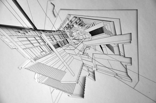
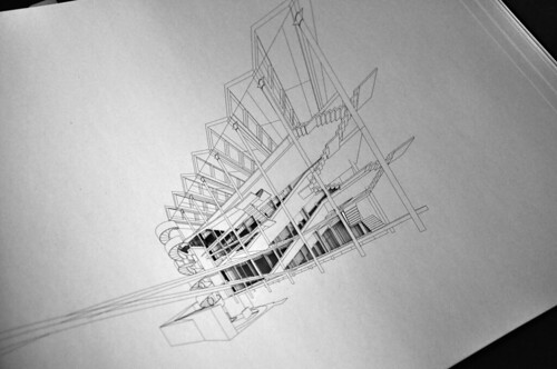
It was however Toyo Ito who coined the term "Diagram Architecture" used it however to characterize the work of Kazuo Sejima, whose work has a "certain clarity in design and legibility and looking at either the plan or the finished work, it resembles a diagram". "(…) a building is ultimately the equivalent of the diagram of the space used to abstractedly describe the mundane activities presupposed by the structure". Furthermore Ito argues that "the strength of Sejima's architecture derived from her extreme reduction (…) to a kind of spatial diagram used to describe the daily activities for which the building is intended in abstract form". The House in a Plum Grove for instance is ver rigorous in achieving reduction, where the plan becomes a diagram. The single-family house offers small functional compartments, where a bed-room for a child perhaps is not much larger than the bed it is supposed to be furnished with. The blackness on a plan, what Eisenman would refer to as pooch, the representation of the invisible structure, is almost reduced to an inexistent minimum – a line. The 'line' of a wall is then translated into a steel-plate construction of 16mm thickness.
Talking to the ARUP Japan's Mitsuhiro Kanada (who works at ARUP Japan and was in charge of structural engineering and design for several project from Zaha Hadid to SANAA and recently Toyo Ito's Metropolitan Opera in Taichung, Tawan) Sejima and Nishizawa, or SANAA, seem to continuously pursue to push the reduction of material properties to an absolute minimum. The Serpentine Pavilion in London, a structure from aluminum and steel was tweaked until the roof was only 2-3mm thin. Arup even developed tiny details to discharge rainwater, but in order to preserve the thinness, the rainwater became in inexistent or ephemeral wall of the structure.
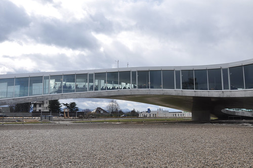
The Rolex Learning Center for the EPFL in Lausanne, which I described in a previous post, is a continuos slab, modest in appearance like a one story high office building, with the difference of an undulating surface, which causes the slab to lift itself and soaringly arch above ground. The President of the EPFL (which belongs together with the ETH Zurich to the ETH-Domain of the Swiss Confederation) Patrick Aebischer explained, that the university was seeking to replace the previous research and library building funded by the watchmaker Rolex with a new building that reflected a modern university campus, where students interact, exchange and learn from early in the morning to late at night. The building is what I would call a 'learning landscape' that sought to generate a creative environment that short-circuits traditional modes of learning. It becomes a new typology and contemporary architectural answer as to how working and learning can be designed and working. The 'line' of the wall is physically and functionally almost entirely immersed into the undulating landscape. Analyzing the building reveals that the program is merely a furnishing and large portions are empty. The diagrammatic quality of the plan is intensified through the diagrammatic programming. SANAA's diagram of aesthetic has overcome program. It is reduced to a tool of perception rather than experience. It appears we have arrived at a state which is beyond program.
© Sasha Cisar, 2011.
-
Sources:
"Delirious New York", by Rem Koolhaas. 1978, Oxford University Press.
www.oma.eu
"AMOMA Rem Koolhaas I : 1996/2006 : delirio y más = delirious and more", by Rem Koolhaas et. al. Madrid: 2006, El Croquis.
Supercritical / Peter Eisenman, Rem Koolhaas; ed. by Brett Steele. 2010, Architectural Association Publications.
SANAA (Kazuyo Sejima +Ryue Nishizawa) : 1983-2004 : Kazuyio Sejima & Associates, Office of Ryue Nishizawa. - [Ed. conjunta, revisada de los números 77(I)+99+121/122] - Madrid: 2007, El Croquis.
http://www.flickr.com/photos/cisar/
http://cisar.blogspot.com/2010/03/epfl-rolex-learning-center-by-sanaa.html
April 12, 2009
Peter Zumthor is awarded the Pritzker Prize 2009

updated_11.50pm_13042009
Peter Zumthor, renowned Swiss architect, was awarded the Pritzker Prize 2009. After having received the Praemium Imperiale in 2008 awarded by the Emperor's house in Japan, he received now the architect's profession highest honors.
Quote from the New York Times article:
“He has conceived his method of practice almost as carefully as each of his projects,” said the citation from the nine-member Pritzker jury. “He develops buildings of great integrity — untouched by fad or fashion. Declining a majority of the commissions that come his way, he only accepts a project if he feels a deep affinity for its program, and from the moment of commitment, his devotion is complete, overseeing the project’s realization to the very last detail.”
The project Peter Zumthor is probably best known for is the alpine spa and thermal bath in Vals in Switzerland and the art museum in Bregenz, Austria. Recently finished were the Bruder Klaus chapel in the rural landscape outside Mechernich between Cologne and Bonn in Germany and the Kolumba, the diocese art museum of Cologne.
More information to follow.
Source:
New York Times
More info:
Pritzker Prize 2009 Laureate @ Pritzkerprize.com,
also Photobooklet (pdf) and Textbooklet (pdf)
Interview with Zumthor @ Chicago Tribune
Washington Post
Articles and critiques on Zumthor's projects @ NZZ (german)
Kunsthaus Bregenz, Kolumba, Bruder Klaus Kapelle, Oblomov Stagedesign
On teaching by Peter Zumthor
Images:
I am currently uploading images of the Kolumba, the Burder Klaus chapel and the Bregenz Museum onto my Zumthor Flickr Set, so check back!
November 10, 2008
Chipperfield to build new Kunsthaus in Zurich
David Chipperfield has been announced as the winner of the international competition to design an extension to the Kunsthaus (art museum) of Zurich, Switzerland. 214 architecture offices from 22 countries were taking part in this competition. As usually in Zurich only the architect has been announced yet, images and more information is yet to be published at a press conference in December. According to the press briefing, a large majority of the jury voted for Chipperfield's project, which is supposed a "classic Chipperfield".1
update
Further information, along with images and plans have been scheduled to be published in December, but according to the Kunsthaus Zurich some unauthorised images were published which only show an early design stage.
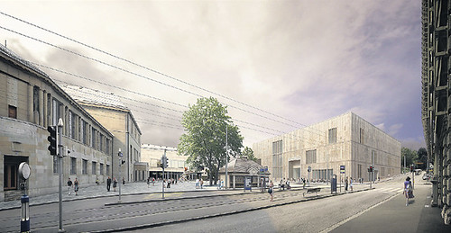
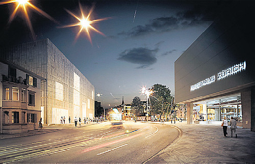
The NZZ describes it as an "unfussy and straightforward art-palazzo without 'starchitect'-allures, an almost Protestant sobriety, austerity and modesty suiting a Zwinglian Zurich" (sort of similar to the Calvinistic Geneva, for the uninitiated).
However the first of the two images shows indeed a very subtle addition that creates somewhat of an ensemble with the existing Kunsthaus building, with similar materialization and color, yet maintaining a certain autonomy. It clearly shows the architects sensibility by the treatment of the situation. Rethinking the Heldplatz as a "Platz" rather than a mere agglomeration transit ways and an infrastructural node, would allow it to become a counterpart to the Bellevue, further towards the Opera house, and a central location for the Hochschul- and Museumsquarter - although this hasn't been part of the competition I do think the city will have to give it some serious thought.
Contrary to perhaps future projects in Basel or existing ones in Lucerne, pushing larger and important buildings in Zurich has become increasingly difficult in the last twenty years, resulting in a number of projects but most of which ultimately disappear. Like the congress center at the lake by Rafael Moneo which didn't survice a public vote on the project. This results in a complete lack of so-called 'icons', e.g. the KKL in Lucerne by Jean Nouvel and similar projects elswhere in Switzerland (of course except perhaps some "older" ones representing a newly found conscious of the city when the federal state was established some 150 years ago; but those buildings, for instance the ETH by Gottfired Semper, had a different relevance and reception at the time)
I guess it is too early to judge solely on two images, but besides that the NZZ got all excited about the Chipperfield's understatement, I am rather hopeful that perhaps this austere appearance will be a good choice for Zurich, at least one that will be accepted by the public.
The building will cost an estimated 150Mio sFr. and should be finished by 2015.
via:
NZZ, "David Chipperfield soll das neue Kunsthaus bauen", 08.11.2008
via NZZ, "Schnörkelloser Kunstpalazzo", 10.11.2008
via 2 "unauthorised images" reaction of the Kunsthaus [PDF], 10.11.2008
Images © of David Chipperfield Architects
October 11, 2008
Libeskind's Westside shopping center opens in Switzerland
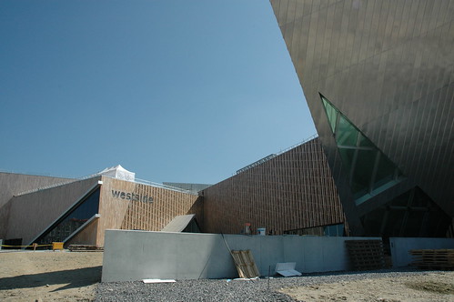
View from north of the outside of the new Westside shopping center, designed by Daniel Libeskind.
updated
Introduction
The Westside shopping center in Brünnen, a part of the city of Berne (the capital of Switzerland) , opened it's gates this weekend.
The project was started 2000, when Daniel Libeskind won an international competition to design the shoppingcenter. Construction did not start until 2006.
The complex not only features a shopping mall, but also a conference-hotel, a cineplex, elderly people housing and a spa.
The whole development at the western most part of the city of Berne will complete a dense housing development started in the seventies and when completed will offer housing to additional 3000 people.
The shoppingcenter is said to cater an area with around 1.2 Million people sourrounding the city of Berne.
More images in my
flickr-set of the Westside shopping Center.
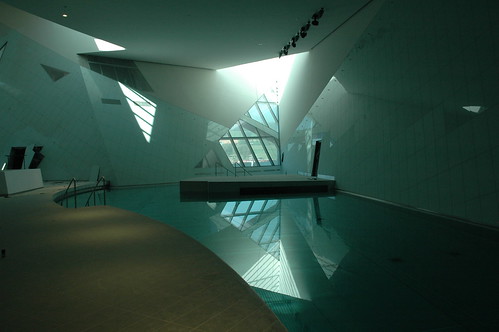
Inside view of the spaa and pool-area, designed by Daniel Libeskind.
View from north of the outside of the new Westside shopping center, designed by Daniel Libeskind.
A critique?
A friend of mine (until I have verified if I am allowed to name him by name) asked me the following question regarding this project:
"Working on a critique, hah? This project seems to me like an extinct scenery for young people: where do the physical presence of elderly people and shops benefit from each other in an experience that claims to be "more than shopping"? It's very admirable to think of elderly people in a project at this scale, but then please tell me, why isn't the whole building capable of wheelchairs etc.? You should actually add that this building is a hoax.
Copy/Paste-ing previously used formal concepts (Jewish Museum, Berlin) to in terms of space and culture totally different locations on the globe is just not the way to do it. Sorry, Mr. Liebeskind."
Additional programming of building
Well isn't it? A building this large, with an Gestaltungsplan for a large part of Brünnen I suppose there were requirements to be wheelchair accessible, I didn't see any barriers or too narrow places on the contrary. This part of a "Mantelnutzung" around the actual shopping part of this complex is nothing particularly new, think of the Joggeli (St. Jakob Stadium) in Basel. The Brünnen AG, who planned the shopping center and the adjacent housing projects, a subsidiary of Migros was even required to add such an amenity by the the city of Berne.
First and second, it's no secret that our society is aging and soon you will have quite a number of people beyond 60 years of age and much older. So how do you face this challenge, actually quite a number of small towns in Switzerland have begun recently to plan and even build Housing for elderly people, often in the town centers, because of exactly this increase which won't happen some time in future but is already happening.
Third, relocating the concept of a mall from the US to Switzerland will ultimately fail if it's not adapted. Interestingly enough the first Swiss mall, the Glattzentrum planned in the sixties, was actually the first of such malls after the American example that was built in Europe. Generally speeking such places in Switzerland, Tivoli, Glatt, Sarganserland etc. pp. are mostly conglomerate of a broad variety shopping functions added over time, meaning you have a conglomerate of building creating a fictional mall-like-experience.
However, the context of Westside is a bit different. Located at the westernmost part of the city of Berne, actually already placed in the Landschaft and not inside the city, the term periphery here could be only applicable to the city itself and not to the "Agglomeration" of Berne, since it's still on the territory of the city.
Why I am making this painstakting distiction is, because exactly that will show us, wether the urban concept and planning will utimately fail or not.
See, at Brünnen you had those housing developments in Corbusier-like fashion that were built in the sixties and seventies. Eventually with this additional planning, which has been in the works since that time but was never realized, you will actually receive a densification of this part of Brünnen/Berne. Adding another 3000 poeple may not be much, but for Brünnen it is.
I suppose having a mixed-use planning would be the first stage or a potentially successfull planning. Also bear in mind that a single Shopping building probably would not generate nearly enough visitors, that's why a spa, cinema and hotel have been added, along the elderly housing.
That all generates traffic and a public (Öffentlichkeit), the additional concept that the ground functions are all walkable and that the area towards the housing area are all car-free might suggest, that it is intended to generate a Stadtteil, rather than a retail outlet, which it is of course.
A spatial separation between housing and shopping is still maintained, and the vertical integration and superposition that perhaps Christiaanse preaches is not implemented.
Considering all this, one still might be cautiously positive about the future development of this area.
The Architectural design
Regarding the visual language, you're right to a certain degree. See, it is my utmost belief that buildings and such complexes should be designed by architects because there is additional value (Mehrwert) that solely developers can't achieve, because how the user feels and interacts inside the building cannot be planned with just efficiency or cost-engineering.
Inside I think, and critiques have shown that I suppose, the shopping center is quite a success, because the rooms are spacious, light and fairly attractive.
(In the context of Brünnen you could argue that the complex takes up the role of the Agora, but that would lead to far and is a whole other discussion, especially because Postmodernism is all about internalising public space, shown with that downtown-hotel in Los Angeles, that was one of the first, featuring a huge multi-purpose lobby)
Outside, on a detail level, the visual language is very appreciable, even the layering and positioning of the volumes is interesting and offers enough complexity.
But with architectural style, particularly with such of one architect, where he/she has developed a visual style that continuously gets repeated on various buildings might pose deeper problems. The problem is, what is exactly this style, are those visual elements that you adapt from one project to another or perhaps only a method that somehow leeds to similar output, because e your mindset works in a particular way.
My intention is not to rationalize the language best seen at the Jewish Museum in Berlin, U agree that ultimately such elements become merely a visual reference to something else, the signified elements have been totally detached and therefore you only get a codified image, index and are not able to reference it to something meaningful, without just creating a visual complexity enriching a façade.
February 19, 2007
Kerez wins Warsaw Museum of Modern Art competition
MoMA competition Warsaw, © Christian Kerez
Originally uploaded by scisar.
Yesterday at an official event in Warsaw the winner of the architecture competition for the museum of modern art in Warsaw has been announced. Christian Kerez, Assistant Professor at the ETH and Architect based in Zürich was awarded the first prize. Daniel Libeskind, a juror of the competition, presented the winner and his modest L-shaped building with a wavy roof.
The future museum will be erected next to the Culture and Science Palace in the center of Warsaw. According to Libeskind the proposal fits well into the neighboorhood of the palace, which was built in a Stalinist style, despite being an avantgarde project. The museum is scheduled to be opened 2010.
Images | via: e-warsaw.pl, museumcompetition.pl, Argauer Zeitung Online
Thanks to Stephan.
September 14, 2006
Herzog De Meuron Tower for Basel
updated on 15.9.06, 16.9.06
Here we go again, after the recent post about the redevelopment of the fair in Basel by Herzog & De Meruon, today at a media briefing in Basel their design for the new tower for Roche was announced and introduced.
Roche, a global health-care company, based in Basel, will be redeveloping their headquarters-campus, also by adding a 160m (524 feet) tower; which would become Switzerland's highest tower. The timetable suggests an approval by the city's council by the end of 2007 and once approved, construction would take place between 2008 and 2011.
First comments from politicians, no matter what couleur, suggest that they are excited about the project and really look forward to it. What pleased them most is the fact, that this tower by Roche is a bold statement for the city of Basel as location.
Take a look at some images, the official presentation and read the official media release.
The redevelopment of the Roche campus will cost about $640 million and will include two buildings by Herzog & De Meuron. The 160m tower mentioned above, will gather 2400 Roche-workplaces, that are currently spread over Basel. Additonally a new research and development (R&D) centre will be built to replace the old laboratory.
Roche is Switzerland's second-biggest pharmaceutical company behind its Basel-based rival, Novartis. It has a total workforce of 70,000 people worldwide, including 7,500 in Switzerland.
Roche, confident in maintaining a strategy of growth, created 1000 jobs in the city of Basel in the past years; their half-year net income rose a 37% to $3.6 billion.
Meanwhile Novartis will invest about $1.5 billion to redevelop it's own campus, not far from the Roche site, their masterplan has already been introduced and Novartis hired such architects as Frank Gehry, Sanaa and Diener & Diener to name a few (more about the Novartis plans here.)
Below a visualization of the project:
Furthermore an interview from from the guys at venicesuperblog (blogging about la Biennale) with Jacques Herzog from HdM about the ETH-Studio Basel and their project on Switzerland, which is shown in the Italian Pavilion:
September 11, 2006
9/11 - The New Cityscape of Fear - updated
Cityscape of fear
The online news magazine Salon recently featured an article about the Cityscape of fear, claiming that the American Architecture is still reeling from the 9/11 attacks. Security is the main concern, even five years since the attacks occured, and you can see the effects everywhere: from jersey barriers in front of the Lincon Center, posts and bollards became ubiquitous aswell as planters and fences. These barricades are sucking the soul out of urban life.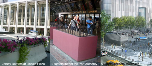 Highrise Boom
The San Francisco chronicle claims that altough the terror threat fails to stem the high rise boom, defensive measuers focus on fortifying the buildings bases against possible attacks. Currently there are five towers are under construction that will exceed 30 stories.While Chicago approved recently the 2000-foot Fordham Spire and Boston will maybe feature soon a 1000-foot tower in the historic finacial district. While Lord Foster's WTC-Design of the "kissing towers" has been rejected, he was able to lead on a series of new mayor towers in New York City that have been introduced after 9/11. Actually his Hearst Tower opened just last year. 2002 the design for the new 1046-foot New York Times Tower by Renzo Piano was hailed as breakthrough for the Manhattan Skyline, it's construction end is slated for 2007.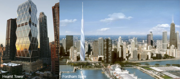
The World Trade Center Site
Last Thurday the plans were unveiled of the last three skyscrapes that will join the Freedom Tower around the former World Trade Center site. These towers altogether will reshape the current skyline of lower Manhattan but the future ensemble won't dominate as much like the former WTC's Towers did. Lord Foster also designed one of the three, which would mark his second tower in Manhattan. The other two were designed by Richard Rogers and Fumihiko Maki. Nicolai Ouroussoff, the NYTimes Chief Architecture critic, writes in his architecture review of the new towers that they illustrate how low our expectations have sunk since the city first resolved to rebuild the site. Mixed views allegorise fellow Archinecter's discussion of the new designs. BBC menwhile ask what exactly it means to build a skyscraper after 9/11 and examines the design of the centerpiece of the WTC site, the Freedom Tower.
The 1776-foot tower had to ensure maximum safety and security, and had to incorporate a number of features. Most notably is the multi-layered glass curtain wall to protect the building form explosions on street level, from which the curtain wall extends about 40 meters and mostly hosts building technology. The building's base, which more resembles a plinth, is probably the strongest sign of retreat and security that has been designed for future towers. "People that still are clinging to the expectation taht the tower will become a monument to the highest American Ideals, the current design should finally shake them out of that delusion." Nicolai Ouroussoff wrote in his review of the Freedom Tower.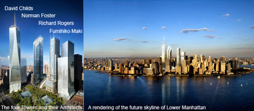 Fear rising? - Epilogue
It is said that Americans are safer now more than they were before the 9/11 attacks. But whith Bin Laden still on the run, after three wars and maybe on the brink of a fourth, poeple feel less secure. Accordingly the Wired Magazine writes that security technology is booming. "Of course, even as technologies improve, none is likely to end the post-Sept. 11 era of hyper vigilance." BBC has again some interesting statistics that show how 9/11 changed America.
Subscribe to:
Posts (Atom)

