November 10, 2008

Chipperfield to build new Kunsthaus in Zurich

David Chipperfield has been announced as the winner of the international competition to design an extension to the Kunsthaus (art museum) of Zurich, Switzerland. 214 architecture offices from 22 countries were taking part in this competition. As usually in Zurich only the architect has been announced yet, images and more information is yet to be published at a press conference in December. According to the press briefing, a large majority of the jury voted for Chipperfield's project, which is supposed a "classic Chipperfield".1

update
Further information, along with images and plans have been scheduled to be published in December, but according to the Kunsthaus Zurich some unauthorised images were published which only show an early design stage.


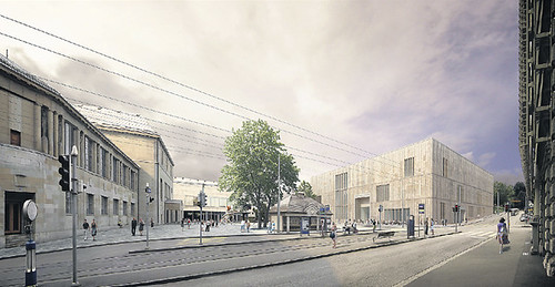
kunsthaus_1.1242465, originally uploaded by scisar.


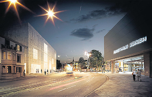
kunsthaus 2_1.1242558-1, originally uploaded by scisar.


The NZZ describes it as an "unfussy and straightforward art-palazzo without 'starchitect'-allures, an almost Protestant sobriety, austerity and modesty suiting a Zwinglian Zurich" (sort of similar to the Calvinistic Geneva, for the uninitiated).
However the first of the two images shows indeed a very subtle addition that creates somewhat of an ensemble with the existing Kunsthaus building, with similar materialization and color, yet maintaining a certain autonomy. It clearly shows the architects sensibility by the treatment of the situation. Rethinking the Heldplatz as a "Platz" rather than a mere agglomeration transit ways and an infrastructural node, would allow it to become a counterpart to the Bellevue, further towards the Opera house, and a central location for the Hochschul- and Museumsquarter - although this hasn't been part of the competition I do think the city will have to give it some serious thought.
Contrary to perhaps future projects in Basel or existing ones in Lucerne, pushing larger and important buildings in Zurich has become increasingly difficult in the last twenty years, resulting in a number of projects but most of which ultimately disappear. Like the congress center at the lake by Rafael Moneo which didn't survice a public vote on the project. This results in a complete lack of so-called 'icons', e.g. the KKL in Lucerne by Jean Nouvel and similar projects elswhere in Switzerland (of course except perhaps some "older" ones representing a newly found conscious of the city when the federal state was established some 150 years ago; but those buildings, for instance the ETH by Gottfired Semper, had a different relevance and reception at the time)
I guess it is too early to judge solely on two images, but besides that the NZZ got all excited about the Chipperfield's understatement, I am rather hopeful that perhaps this austere appearance will be a good choice for Zurich, at least one that will be accepted by the public.
The building will cost an estimated 150Mio sFr. and should be finished by 2015.

via:
NZZ, "David Chipperfield soll das neue Kunsthaus bauen", 08.11.2008
via NZZ, "Schnörkelloser Kunstpalazzo", 10.11.2008
via 2 "unauthorised images" reaction of the Kunsthaus [PDF], 10.11.2008
Images © of David Chipperfield Architects

October 11, 2008

Libeskind's Westside shopping center opens in Switzerland


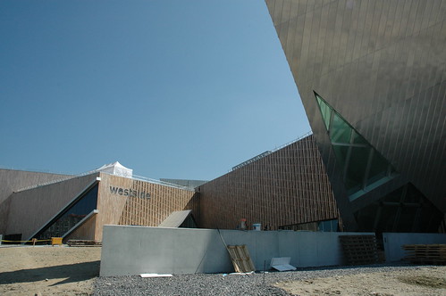
View from north of the outside of the new Westside shopping center, designed by Daniel Libeskind.

updated

Introduction
The Westside shopping center in Brünnen, a part of the city of Berne (the capital of Switzerland) , opened it's gates this weekend.
The project was started 2000, when Daniel Libeskind won an international competition to design the shoppingcenter. Construction did not start until 2006.
The complex not only features a shopping mall, but also a conference-hotel, a cineplex, elderly people housing and a spa.
The whole development at the western most part of the city of Berne will complete a dense housing development started in the seventies and when completed will offer housing to additional 3000 people.
The shoppingcenter is said to cater an area with around 1.2 Million people sourrounding the city of Berne.

More images in my
flickr-set of the Westside shopping Center.
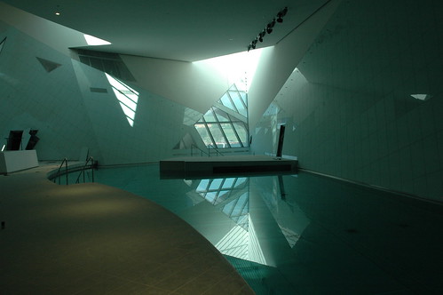


Inside view of the spaa and pool-area, designed by Daniel Libeskind.


View from north of the outside of the new Westside shopping center, designed by Daniel Libeskind.

A critique?
A friend of mine (until I have verified if I am allowed to name him by name) asked me the following question regarding this project:

"Working on a critique, hah? This project seems to me like an extinct scenery for young people: where do the physical presence of elderly people and shops benefit from each other in an experience that claims to be "more than shopping"? It's very admirable to think of elderly people in a project at this scale, but then please tell me, why isn't the whole building capable of wheelchairs etc.? You should actually add that this building is a hoax.
Copy/Paste-ing previously used formal concepts (Jewish Museum, Berlin) to in terms of space and culture totally different locations on the globe is just not the way to do it. Sorry, Mr. Liebeskind."


Additional programming of building
Well isn't it? A building this large, with an Gestaltungsplan for a large part of Brünnen I suppose there were requirements to be wheelchair accessible, I didn't see any barriers or too narrow places on the contrary. This part of a "Mantelnutzung" around the actual shopping part of this complex is nothing particularly new, think of the Joggeli (St. Jakob Stadium) in Basel. The Brünnen AG, who planned the shopping center and the adjacent housing projects, a subsidiary of Migros was even required to add such an amenity by the the city of Berne.
First and second, it's no secret that our society is aging and soon you will have quite a number of people beyond 60 years of age and much older. So how do you face this challenge, actually quite a number of small towns in Switzerland have begun recently to plan and even build Housing for elderly people, often in the town centers, because of exactly this increase which won't happen some time in future but is already happening.
Third, relocating the concept of a mall from the US to Switzerland will ultimately fail if it's not adapted. Interestingly enough the first Swiss mall, the Glattzentrum planned in the sixties, was actually the first of such malls after the American example that was built in Europe. Generally speeking such places in Switzerland, Tivoli, Glatt, Sarganserland etc. pp. are mostly conglomerate of a broad variety shopping functions added over time, meaning you have a conglomerate of building creating a fictional mall-like-experience.
However, the context of Westside is a bit different. Located at the westernmost part of the city of Berne, actually already placed in the Landschaft and not inside the city, the term periphery here could be only applicable to the city itself and not to the "Agglomeration" of Berne, since it's still on the territory of the city.

Why I am making this painstakting distiction is, because exactly that will show us, wether the urban concept and planning will utimately fail or not.
See, at Brünnen you had those housing developments in Corbusier-like fashion that were built in the sixties and seventies. Eventually with this additional planning, which has been in the works since that time but was never realized, you will actually receive a densification of this part of Brünnen/Berne. Adding another 3000 poeple may not be much, but for Brünnen it is.
I suppose having a mixed-use planning would be the first stage or a potentially successfull planning. Also bear in mind that a single Shopping building probably would not generate nearly enough visitors, that's why a spa, cinema and hotel have been added, along the elderly housing.

That all generates traffic and a public (Öffentlichkeit), the additional concept that the ground functions are all walkable and that the area towards the housing area are all car-free might suggest, that it is intended to generate a Stadtteil, rather than a retail outlet, which it is of course.
A spatial separation between housing and shopping is still maintained, and the vertical integration and superposition that perhaps Christiaanse preaches is not implemented.
Considering all this, one still might be cautiously positive about the future development of this area.

The Architectural design
Regarding the visual language, you're right to a certain degree. See, it is my utmost belief that buildings and such complexes should be designed by architects because there is additional value (Mehrwert) that solely developers can't achieve, because how the user feels and interacts inside the building cannot be planned with just efficiency or cost-engineering.
Inside I think, and critiques have shown that I suppose, the shopping center is quite a success, because the rooms are spacious, light and fairly attractive.
(In the context of Brünnen you could argue that the complex takes up the role of the Agora, but that would lead to far and is a whole other discussion, especially because Postmodernism is all about internalising public space, shown with that downtown-hotel in Los Angeles, that was one of the first, featuring a huge multi-purpose lobby)
Outside, on a detail level, the visual language is very appreciable, even the layering and positioning of the volumes is interesting and offers enough complexity.

But with architectural style, particularly with such of one architect, where he/she has developed a visual style that continuously gets repeated on various buildings might pose deeper problems. The problem is, what is exactly this style, are those visual elements that you adapt from one project to another or perhaps only a method that somehow leeds to similar output, because e your mindset works in a particular way.
My intention is not to rationalize the language best seen at the Jewish Museum in Berlin, U agree that ultimately such elements become merely a visual reference to something else, the signified elements have been totally detached and therefore you only get a codified image, index and are not able to reference it to something meaningful, without just creating a visual complexity enriching a façade.
May 13, 2008

HOSOYA SCHAEFER Architects (Part III) - Partnership Smartinska in Ljubljana


Well Hosoya Schaefer Architects have done it again: Only within a few weeks since the office last announced they won the competition of the Engadin Airport, now they have won the competition for a masterplan in Ljubljana, Slovenia (EU).

Read the press release:

"HOSOYA SCHAEFER ARCHITECTS win 1st prize in the urban design competition “Partnership Smartinska” in Ljubljana, Slovenia.

May 5, 2008:
The Chamber of Architecture and Spatial Planning of Slovenia (ZAPS) has announced that Hosoya Schaefer Architects won the first prize in the urban design competition “Partnership Šmartinska”. The task was to create a masterplan for the redevelopment of 230 ha in Ljubljana. This strategically important site in Ljubljana stretches from the central railway station to the highway ring and, among other areas, includes BTC City, one of the largest retail developments in Europe. The winning proposal was developed in collaboration with Space Syntax, London and Wüest & Partner, Zürich.

At the heart of the proposal is a triangular central park of 7.4 ha. On its north side a new boulevard transverses the entire site. It is the infrastructural backbone and main organizing element of the redevelopment area and connects it to the central station and the city center. While it is to long for pedestrian flows over its entirety, it contains areas of interest that induce pedestrian traffic: The BTC Boulevard is the pedestrian axis for the BTC retail area with BTC Plaza as its main focus. The proposed Central Park is the green heart of the entire redevelopment area. Kolinska Square is the new entrance to the quarter and acts as a cultural and commercial attractor drawing visitors both from the center and the surrounding neighborhoods. Larger distances can be traveled by tram that runs on the boulevard from the central train station to the outer ring.

The proposal is based on two different urban patterns and their associated functions: the extension of the city fabric with the clarity, accessibility, flexible program mix and long life cycle of its main typology the perimeter block; and the extension of the BTC area with its generous spaces, large volumes, ease of movement (albeit at the moment mostly by car) and shorter building life cycles with high commercial returns. The proposal aims to strengthen the existing qualities of the two patterns and connect them to a larger whole. It allows for mixed use on large and small scales and the subsequent development of urbanity around a variety of new places and program clusters.

Principles of sustainable urban development have been applied both on the level of spatial layout as well as infrastructure and have been proposed for building requirements. The phasing strategy proposed implements the strategic elements first. Various scenarios can unfold and the typologies proposed are flexible. The plan can also be operative when only executed in parts as long as the urban network and armature are implemented.

About HOSOYA SCHAEFER ARCHITECTS

HOSOYA SCHAEFER ARCHITECTS is an international practice for contemporary architecture, strategies and research based in Zürich, Switzerland. Hiromi Hosoya and Markus Schaefer founded the firm in 2003. The firm won a ContractWorld Award 2008 for their first realized project, a restaurant built for Autostadt, the theme park and communications platform for the Volkswagen Group in Wolfsburg, Germany. Recently, it won the first prize in the competition for the new airport building at St. Moritz – Samedan in Switzerland.

Current projects of the firm include a new building for the La Rinascente department store (14,000 m2) and an office building for Risanamento Spa (27,000 m2) in Milano Santa Giulia in Italy. Both Hiromi Hosoya and Markus Schaefer are currently professors at the Academy of Fine Arts in Vienna, Austria."

End of press release.

This sounds very interesting and of course we are curious to see more images and plans of the scheme also to be enabled to make an opinion for ourselves of the project. Nonetheless there are two things I should mention. Firstly Hosoya Schaefer Architects teaming up with Space Syntax and Wüest und Partner, two consulting companies. Space Syntax developed at the University College in London a "computer-based modelling technique to treat cities and buildings ‘space first’, that is as the network of spaces we use and move through." (1) This seems to be like a more detailed and localized version of the MVRDV Regionmaker. Wüest und Partner on the otherhand, a rather huge player in real estate onsultancy in Switzerland with lot's of know-how particulary regarding estimation and developemt of and on the economics of viable real-estate, residential and multi-use (sounds like a tag-line). These partners and the press release might suggest a very pragmatic and differentiated approach on structuring such a huge site to garner a certain critical size.
The other interesting aspect is, that Hosoya Schaefer Architects, particularly Markus Schaefer, are no strangers to Ljubljana. He has tought together with Marijn Spoelstra a research and project semester on Ljubljana at the Berlage Institute in 2006/7 called "Light Capital: Urban Scripts for Ljubljana" (find a description here) which was also featured at the Venice Biennale.


Images © HOSOYA SCHAEFER Architects,
More Images and info, with project credits: here

April 28, 2008

Topkapi Seraiye

Some fish on Pera

April 27, 2008

Sinan in Edirne

March 14, 2008

Yahoo moves European base to Switzerland

Zurich has the European headquarter of Google and the region of Geneva will have the new European headquarter of Yahoo.
Who's next?
via

btw: sfr is now of higher value than $...

March 04, 2008

iPHONE mit SWISSCOM am 4. April


"It simply announces what Swiss residents have been waiting for a long time already: the iPhone will be available in Switzerland from April 4th exclusively via Swisscom. To celebrate this announcement, the historical Swiss telecom company will also change its logo the same day."

via

February 26, 2008

morphing (nano) cellphones - nokia research

February 23, 2008

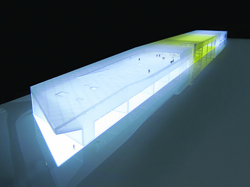
HOSOYA SCHAEFER Architects (Part II) - Engadin Airport

Engadin Airport © HOSOYA SCHAEFER Architects

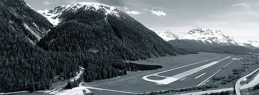
On February 12th it was announced that HOSOYA SCHAEFER Architects have won the first prize in the competition to design the new buildings for the Engadin Airport near St. Moritz. The competition was started last year and should satisfy the need of a growing airport, which is highest situated in Europe with 1707 (5600ft), for improvements and reorganization of it's infrastructure. The current airport was bought by the Canton Graubünden from the Army in 2004 and was consequently transformed into a civilian airport. Topping 17'000 flight movements a year, this airport has established itself as an important infrastructure to the remote region in the Swiss Alps. Stationed here are gliders, helicopters and five airlines that offer charter flights to Europe and elsewhere. But probably the most important effect this airport has for its region is the possibility that guests get high accessibility to the luxurious residencies, hotels and ski-resorts of the famous vacationing spot of St. Moritz. This region that heavily depends upon tourism, has gone to great lengths to expand offers to the high class segment, which this extension and redevelopment of the airport marks the peak so far.

Engadin Airport

About the project
(quoted from the press release)
In addition to operational facilities, the program includes a large restaurant, a hotel, facilities for events and hangars for aircrafts, helicopters and gliders.
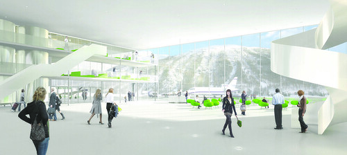
The winning project titled “Sungate” proposes a monolithic building that combines all the different functions into one long shape creating a clear edge to the airfield. In the center of the building the hangar for aircrafts is combined with a large three-storey high lobby space creating a generous light filled gate mediating between the airfield and the valley. The lobby acts as a programmatic hinge that
allows for combining the different areas of the building into multiple scenarios of use. Thermal solar collectors on the roof over the hangar are feeding large water tanks that store solar energy while the building itself is built as a light construction, a hybrid structure combining aluminum and wood. With
the addition of a wood pellet furnace, the building is planned to be heated to 100% by renewable energy. With a large south-oriented terrace, various additional functions and the central lobby, the airport will become a destination for locals and international guests alike. The design was developed in collaboration with Mitsuhiro Kanada / Arup London for structure and Waldhauser Haustechnik AG,
Basel for MEP services.

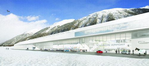
Engadin Airport, St. Moritz - Samedan © HOSOYA SCHAEFER Architects

What the jury had to say
(quoted and translated from the press release)
The exterior of the main building is convincing through its restraint and timeless elegance. The generous and centrally located foyer and lobby creates a gateway to the Engadin, not only for the village of Samedan but also for the arrival hall for the passangers. A transparent façade underlines the experience of aviation for the passangers and visitors alike. The capable organization of the single elements of the building allows adjustments for seasonal fluctuations in occupancy and passanger count due to a flexible spatial concept, the interior can adapt to the necessities of the offered services.

Engadin Airport, St. Moritz - Samedan © HOSOYA SCHAEFER Architects

Conclusion
Obviously designing an airport offers certain challenges beyond the programmatic requirements due to the fact that additional to bulding codes, the airport has to adhere to whole different set of rules, those of the federal aviation agency (BAZL - Bundesamt für Zivilluftfahrt). Those constraints have limited the placement of a new building for the Engadin Airport, which is supposed to replace the old hangars and buildings, some still from the time this was an army airport.
This begs the question how to combine hangars, arrival and departure halls, and other programm parts? The result is as obvious as it is logic at the same time, a horizontal slab with programmatic segments. The simplicity of this diagram might be striking in it's clear structuring, the architectural representation however would create real challange in order to accomodate all the beforehand mentioned.
From my point of view, nowadays a common concept for airports is that the public areas and buildings are either designed or covered under an appealing skin that wraps around the vast open spaces that first Norman Fosters' Stansted Airport near London declared and defined almost 20 years ago as the quasi-standard of airport design. As a byproduct these sometimes beautiful boxes have some less appealing siblings that house functional elements for an airport, such as technology, hangars or various other elements, that are efficiently organized but not necessarily designed. An exception in Switzerland might be the new Terminal E by AGPS and the adjacent utility building that features a wooden cladding and it's height is declining to signify a change in what is stored inside, however the two buildings are still separated.
My point would be that the proposal by HOSOYA SCHAEFER Architects was able to include representational elements of the design along with functional parts and distribute them under a combining roof. In this case the roof is a structure that defines the upper thickness of this "modernistic slab", which OMA is using recently but only figuratively. This structure which allows the different functional and programmatic parts to be connected with, was again developed like on the previous project I featured on dialog, in collaboration with Mitsuhiro Kanada of ARUP in London.
What is striking is the sectional melange of the aforementioned diagram, where the structure that covers the hangars is activated on top with a visitors terrace. This physical overlapping of the program is also enhanced by the semi-transparent façade that wraps around the more technical spaces and the public spaces alike.
The gorgeous renderings are certainly very seductive, but the also show this often contradicting desire to reveal the inside towards the outside and at the same time open it self, in this case towards the panorama of the Swiss alps.
Since such small airports function often differently than larger solely commercial airports, the building has to adapt accordingly, which also means to the certainly important high-end clientèle which I mentioned above. Thus the airport as itself is not only a built diagram but also a designed environment that as to have a lounge-like appeal but at the same time feel much more spacier and has to live up to the different user identification with the airplanes.
I think this proposal is rather successful in creating this inviting and friendly atmosphere, yet meet the expected demureness of this region. The gesture is clear and clean but offers the unexpected. It might actually live up to the high expectations, I am certainly already saving for my first "flight" to the Engadin.

Images © HOSOYA SCHAEFER Architects,
More Images and info, with project credits: here
Press Release of the Airport Engadin: here (doc)
Project Text of HOSOYA SCHAEFER Architects: here (pdf)

HOSOYA SCHAEFER Architects (Part I) - Stadtraum HB Baufeld E

Baufeld E - Stadtraum HB, Zürich © HOSOYA SCHAEFER Architects
Last year the city of Zurich approved a masterplan by Kees Christianse of KCAP for the so called Stadtraum HB, a redevelopment plan of an area behind the main train station (Hauptbahnhof) in the center of Zurich. Most of the buildings belong to the Swiss Federal Railways (SBB) and have been included with some adjacent parts, along the former post building. The total area of 78'000m2 will be transformed into a mixed-use neighboorhood with 400 apartments and approximately 5000 will be working there in future. Additionally some 2000 students of the PHZ (College of Education) will be situated there.
There are nine lots and for each a competition is held. According to the masterplan this current lot "E" (Baufeld E) has to have a minimum of 40% housing and can have a maximum of 40m height.

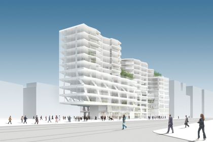
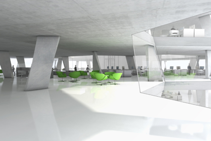
The image above is one of the projects of the competition for the lot "E" and was designed by HOSOYA SCHAEFER Architects.
They say the following on their website about their project:
"The proposal layers the functions horizontally resulting in deep floor slabs that are lit with internal courts and light wells. Since all the layers have different spatial and structural requirements a flexible hexagonal module has been adopted. Each hexagon is supported by three “ribbon columns” that can change orientation relative to the module and move from corner to corner. This allows for smooth adjustments between floors without expensive and inefficient transfer structure. In the front area of the building the ribbon columns run diagonally through the floors and together with vertical tension rods for a large truss supporting the cantilevered front of the building.
The three housing types are separated by roof gardens providing a variety of spaces, public and private, on the upper floors."


Baufeld E - Stadtraum HB, Zürich © HOSOYA SCHAEFER Architects

I had to share with you the two gorgeous images and on their website you can find more and some plans of the project. Admittedly I have worked in this office for a short while, unfortunately not on this project though. I haven't seen the results of the competition yet and to date I was not able to find out when they are being published, however I think it's worth looking at this project for instance, because it offers a rather fresh approach on the constraints, programatical and formal, that are imposed by the competition or the rather conservative architectural establishment in Zurich. It makes you wonder, how to be expressive without appearing so, in a sense subversive.
This project is based on a cell-like structure that horizontally organizes space (and program) and vertically works to load bearing. The huge cantilever is ARUP approved and creates a covered urban square. Admittedly the images look are seductive, what I can't find out, due to lack of material available on the project so far, is the distribution of the program. I assume the housing is located on the building's south side while the north side, the base and lower parts of the building are offices. From south the building appears to break down into multiple parts while it maintains a visually dominant and representational head on the north side, along with it's public program.
As much as I like the images, the real problem here is, that the surrounding lot's either had or will have competitions for future buildings, but mostly they haven't been defined yet, therefore there is no real context to this project. It is confined to function within strict rules, but imposed by the master plan and it's interior organization.
Final judgment therefore is nearly impossible, however I hope the winning project for the lot "E" in this case will be equally progressive with it's proposed architecture, as this building suggests it might be.

Images © HOSOYA SCHAEFER Architects,
Images and plans: here
Masterplan (PDF in German): here

February 13, 2008

Architecture in Europe - Overview Pt. 2

Here a map of the various sites I will feature in the upcoming posts.

View Larger Map

February 11, 2008

Architecture in Europe - Overview Pt.1

Over the course of the next few days I will finally resume my posting. The emphasis of this batch of posts is new and contemporary architecture around Europe and especially in Switzerland. I have plethora of new images which I would like to share with my readers.
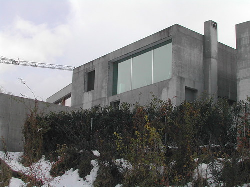
Take with me a tour of Chur and see some interesting redevelopment near the train station in the city center, which has completely changed during the last five years. An exclusive tour of the House Gartmann will show you how one can build a house with only concrete and no insulation!
DSCN0827
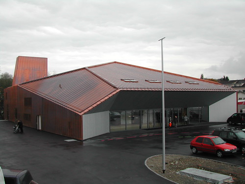
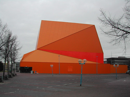
Then we will go further down the Rhine to the shores of the Lake Constance where one can find an excellent example of how swiss architects are trying to go beyond the typical box.
DSCN0349
Similar, who knows, but certainly equally expressive in it's form is the new Agora by UN-Studio. I was able to get some images of this new building which one can find within a rather peculiar setting.
DSCN1870
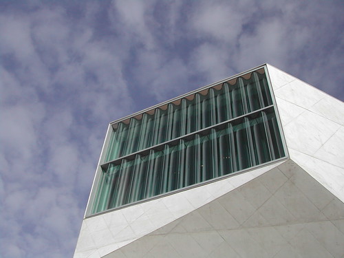
Talking about form and contemporary new public places, we have to consider the critically acclaimed Casa de Musica by OMA. I think you will be able to get a very good glimpse by the dozens of images I was able to shoot, why this building finds acceptance even between the more classical architects.
DSCN1086
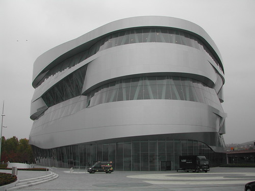
Another interesting building is the Mercedes-Benz Museum in Stuttgart, it attracts thousands of visitors each day, including myself late last year. We shall examine why this is probably one of the most successful UN-Studio buildings so far.
DSCN0719
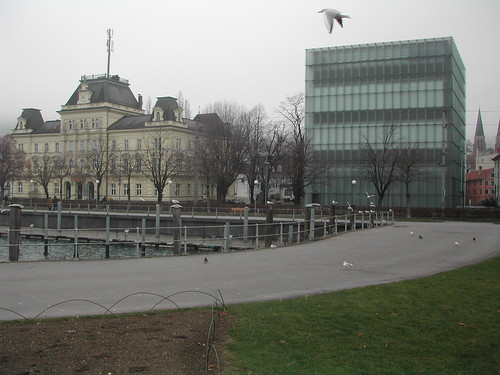
Also at the Lake Constance, but in Austria we find the famed Kunsthaus by Peter Zumthor. Recently there was an exhibit on his work with huge models that one could even enter.
DSCN1323
Going back to Switzerland we have to look at the recent installation by Olafur Eliassion and how he yet again attacked the notion of a house and it's particular interiority.
DSCN1504
After finally revisting my birth place I would like to share some gorgeous images of modernist church near the Lake Lucerne.
DSCN1445
Last but not least, we will go to Basel and it's sourroundings to admire some of the work of Herzog & De Meuron.
DSCN2574
Finally we will try to understand the shift of the formal vocabulary in the work of Herzog & De Meuron which was most probably consummated in last years and eventually reached their home town in a mysterious manifestation: a yet unpublished house.
DSCN2604
Naturally there is much more to see, images, observations and some other very special features to look forward to.

SC