April 15, 2011

January 18, 2011
Actelion Business Center by Herzog & de Meuron near Basel
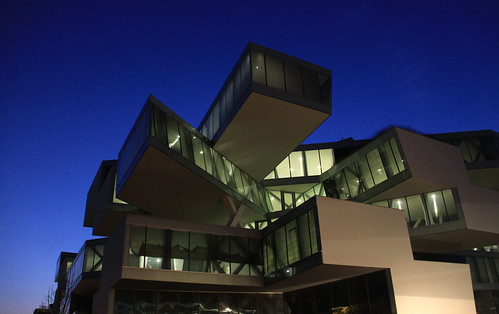
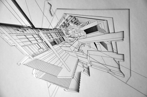
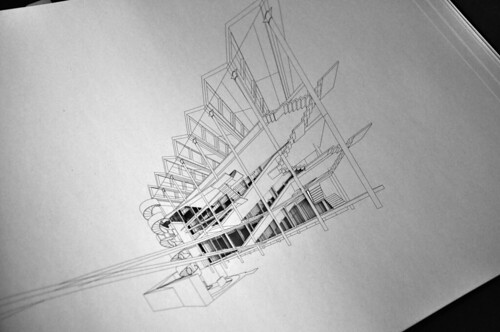
In Allschwil/Basel a new Business Center has opened for Actelion. The Business Center, together with a second research and development building, were designed by Herzog & de Meuron and will form an extension for 380 employees. While the Business Center opened December 10 2010, the R&D building will be ready in 2011.
Quoting from the press release:
Dr. Jean-Paul Clozel, Chief Executive Officer of Actelion said: "After a three-year construction phase, we are delighted to be able to hand over the building to our employees. The architecture stands for innovation, openness and communication and thus symbolizes core values of our company." Jean-Paul Clozel added that "The new Business Center offers our employees an innovative, inspiring work environment."
Particularly interesting is the individual articulation of the floor plans accentuated by cantilevering horizontal elements. Piled slabs and floors of different sizes, where Each floor is cut open from what might have been a regular office building. Although chaotic in appearance, the slabs meet at four different crossing points per floor organized around static demands and programming. The superimposition of the elements in those crossing points, the floorslab doubles as ceiling of the next floor and thus occasionally blurs the legibility.
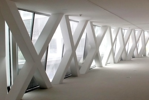
The load-bearing structure of steel frames in k-,x, or I-shapes is hidden behind the façade but still faintly visible. The largely carbon neutral building utilizes a concept of a green roof, designed by the artist Tita Giese.
Although different in concept, the basic premise of stacking and piling seems to be a reoccurring theme with H&deM recently, where this building clearly has a relative in the not far away VitraHaus. Both buildings are published in the current El Croquis 152/153 on H&deM.
Actelion Ltd is a biopharmaceutical company in Allschwil near Basel in Switzerland. Founded in 1997 it focuses on research of Endothels (what separates vascular wall from blood stream) with about 2400 employees worldwide, from which 1000 work in Allschwil.
Layout
Office for 350 workplaces
2 basement floors
6 upper floors (incl. ground floor)
, Auditorium (seating for 120 persons),
Restaurant (seating for 230 persons),
Cafeteria
, 150 parking spaces
Technical data and costs
Plot size: 7610 m2
Floor area of building: 3190 m2
Building dimensions: Length:80 m
Width:80 m
Height:21 m
Volume of building: 104,500 m3
(65,900 m3 above ground and 37,600m3 underground)
Floor space: 27,470 m2
Facade area: 15,020 m2
Costs: CHF 130 million
The photographer Idit Kobrin, whose photos I used for this blog post, has made the official photos of the Actelion Ltd. building and obviously she has a beautiful flickrset with many more.
The Actelion Research and Clinical Development building (below) will be opened later this year.

Sources:
Photos © Actelion Ltd. and Photographer Idit Kobrin.
Rendering © Herzog & de Meuron.
January 12, 2011
Beyond Program - On Diagram in OMA and SANAA
In "Delirious New York" Koolhaas describes a metropolitan development that is parallel, almost an alternative reality, to the broader modernist narrative. The New York City grid, a repetitive scheme, allows for the city-block to articulate almost infinite iterations only limited by height and set-backs. That is conceptually similar to the relationship between the building and the façade which was separated by what Koolhaas in surrealist fashion refers to as lobotomy. That allows the façade to be a independently articulated and not refer to the interior. The latter however is therefore liberated to adjust to the function of the building. With the downtown Manhattan Athletic Club, the program in particular generates a very distinct interior, where each floor starts to react to the program. Consequently the section becomes more important than the plan. The section becomes a strategy how to differentiate program.
In Parc de la Vilette, Koolhaas and his Office OMA (Office for Metropolitan Architecture), the section literally became the new plan. They used the section of the Downtown Manhattan Athletic Club to create "zones of major programmatic categories". For Koolhaas the diagram is in fact an organizational and strategic tool for program, it is a diagram of program. In Supercritical, Eisenman would call it "Content is Form". The Cartier des Halles in Paris could be used as a good visualization of 'diagram of program'. A redevelopment of a traditional market turned shopping center and huge subway hub and exchange in the center of Paris, close by to the Centre Pompidou. Two diagrams explain the project, one highlighting the current programming. Another one which is the same, just with the difference that the programmatic stripes are altered to outline shapes that OMA inserted into the site for the reason to "overcome schizophrenia beaten underground existence and above ground inexistent". That is basically all you need to understand, to "read" the project, the model is just extra. Contrary to the Downtown Manhattan Athletic Club, the Jussieu Libraries project offered connected floors: "A simple stacking of floors, sections of each are manipulated to touch those above and below; all the planes are connected by a single trajectory, a warped interior boulevard that exposes and relates all programmatic elements". It could be regarded as a critical translation and progression from the Athletic Club. According the Jussieu project extends the urban experience, from the city into the building. Using the surrealist (Paranoid Critical Method), the building becomes the city's extension (like an additional limb). Through the continuous surface the building becomes an "urban scenario". The Royal Dutch Embassy could be regarded as further translation, where a interior circulation ramps up a "disciplined cube". Instead of warped surfaces like in Jussieu, the embassy features a more traditional sequence of corridors and stairs to which the program is attached to; the program becomes an 'extension' of the circulation.
It was however Toyo Ito who coined the term "Diagram Architecture" used it however to characterize the work of Kazuo Sejima, whose work has a "certain clarity in design and legibility and looking at either the plan or the finished work, it resembles a diagram". "(…) a building is ultimately the equivalent of the diagram of the space used to abstractedly describe the mundane activities presupposed by the structure". Furthermore Ito argues that "the strength of Sejima's architecture derived from her extreme reduction (…) to a kind of spatial diagram used to describe the daily activities for which the building is intended in abstract form". The House in a Plum Grove for instance is ver rigorous in achieving reduction, where the plan becomes a diagram. The single-family house offers small functional compartments, where a bed-room for a child perhaps is not much larger than the bed it is supposed to be furnished with. The blackness on a plan, what Eisenman would refer to as pooch, the representation of the invisible structure, is almost reduced to an inexistent minimum – a line. The 'line' of a wall is then translated into a steel-plate construction of 16mm thickness.
Talking to the ARUP Japan's Mitsuhiro Kanada (who works at ARUP Japan and was in charge of structural engineering and design for several project from Zaha Hadid to SANAA and recently Toyo Ito's Metropolitan Opera in Taichung, Tawan) Sejima and Nishizawa, or SANAA, seem to continuously pursue to push the reduction of material properties to an absolute minimum. The Serpentine Pavilion in London, a structure from aluminum and steel was tweaked until the roof was only 2-3mm thin. Arup even developed tiny details to discharge rainwater, but in order to preserve the thinness, the rainwater became in inexistent or ephemeral wall of the structure.
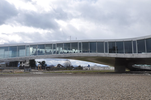
The Rolex Learning Center for the EPFL in Lausanne, which I described in a previous post, is a continuos slab, modest in appearance like a one story high office building, with the difference of an undulating surface, which causes the slab to lift itself and soaringly arch above ground. The President of the EPFL (which belongs together with the ETH Zurich to the ETH-Domain of the Swiss Confederation) Patrick Aebischer explained, that the university was seeking to replace the previous research and library building funded by the watchmaker Rolex with a new building that reflected a modern university campus, where students interact, exchange and learn from early in the morning to late at night. The building is what I would call a 'learning landscape' that sought to generate a creative environment that short-circuits traditional modes of learning. It becomes a new typology and contemporary architectural answer as to how working and learning can be designed and working. The 'line' of the wall is physically and functionally almost entirely immersed into the undulating landscape. Analyzing the building reveals that the program is merely a furnishing and large portions are empty. The diagrammatic quality of the plan is intensified through the diagrammatic programming. SANAA's diagram of aesthetic has overcome program. It is reduced to a tool of perception rather than experience. It appears we have arrived at a state which is beyond program.
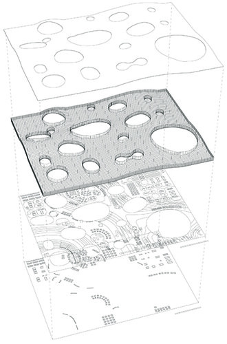
© Sasha Cisar, 2011.
-
Sources:
"Delirious New York", by Rem Koolhaas. 1978, Oxford University Press.
www.oma.eu
"AMOMA Rem Koolhaas I : 1996/2006 : delirio y más = delirious and more", by Rem Koolhaas et. al. Madrid: 2006, El Croquis.
Supercritical / Peter Eisenman, Rem Koolhaas; ed. by Brett Steele. 2010, Architectural Association Publications.
SANAA (Kazuyo Sejima +Ryue Nishizawa) : 1983-2004 : Kazuyio Sejima & Associates, Office of Ryue Nishizawa. - [Ed. conjunta, revisada de los números 77(I)+99+121/122] - Madrid: 2007, El Croquis.
http://www.flickr.com/photos/cisar/
http://cisar.blogspot.com/2010/03/epfl-rolex-learning-center-by-sanaa.html
January 06, 2011
Herzog & de Meuron Tower for Basel II
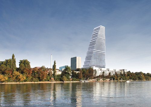
Two years ago the Pharmaceutical Company Roche, which headquarter is located in Basel, presented a high rise building by Herzog & de Meuron which would twist into Basel's skyline. The project was however abandoned by Roche, apparently because it conflicted with the company's program for that building. Roche continued to work with H&deM and on December 17th presented the "building 1" (Bau 1). It should offer 1900 workplaces and should replace the "Twist 2 Spirals". The company will seek building approval by the city. Roche's CEO says: "Roche needs a highrise office building in Basel. The spatial proximity of all the company's departments - R&D, production, marketing and directorate - is crucial for a successful cooperation. Therefore will want to recollect our 1800 employees which are currently scattered across the city and bring them back to the headquarter."
The building's color scheme is adapted to the existing at the Roche Campus and should be regarded as a continuation of the work of the architect Otto Salvisberg, who created the modernist buildings for Roche in the first half of the last century.
Along the said workspaces, a 500-seat auditorium, cafeteria and communication zones are planned.
The building will be 41 stories, approximately 175m, high and offer 76'000m2 space. Costs should be about 550million Swiss Francs. It should be an energy efficient Minergie building.
Via: Roche. Images here. Copyright © F. Hoffmann-La Roche Ltd.
New Basel by MVRDV
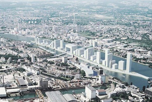
Coinciding with the opening of the IBA Basel 2020 (Internationale Bauaustellung, international building exhibition) the building department of the city of Basel presented "New Basel". Fritz Schumacher, the city planner of Basel explained that the Visualization made by MVRDV should show the possibility of a future development of Basel on a soon-to-be brownfield harbour on the Rhine. The small strip has the potential to totally alter the skyline of the city. A vision for 2020, to include housing, businesses, the city could reclaim a former harbour and industrial area in the corner bordering Germany and France. The harbour which is used to load and unload containers shipped and received from Rotterdam is supposed to be moved to offer more space. The moving of the harbour obviously is the requirement for the city to be able to start developing the lot, which is still covered by railroads and storage buildings. MVRDV together with local planners Marin Josephy and Philippe Cabane suggested to open up this small peninsula, to allow the Rhine to flow and generate a small island. The development also should not stop at the border but include the towns of Weil, Germany, and Huningue, France. According to the city planner Schumacher this future Klybeck island, should become part of the IBA development for Basel.
Via: http://www.nzz.ch/nachrichten/politik/schweiz/new_basel__eine_schweizer_hafen-city_1.9002998.html
http://www.tagesanzeiger.ch/schweiz/standard/Manhattan-mitten-in-Basel/story/22884814
https://twitter.com/#!/MVRDV
January 05, 2011
January 03, 2011
On the Internet as the Locus of the Digital Culture
This text is an experiment. I am by all means no expert on the following subjects. Except that I have witnessed them and my experience allows me to critically assess, what I think is not theorized enough. Before theorizing however, I tried to contextualize a little, what can be described as the "digital culture". This frame of reference is outlined and elaborated upon below and by all means not complete, merely a first attempt.
I suppose this is where I have to take issue. My usage of the metaphor would be to turn the sock inside out, where now the digital wraps around everything else.
Firstly I should mention, that with the digital, I mean the Internet and networking in general. We are in a state which is (still) beyond comprehension, because we have created something that is about to fundamentally change, well, many things, because if you cannot comprehend the extent of the phenomenon, it is difficult to assess how it will affect us, except with very particular examples. The Internet and the digitalization of our lives, is a phenomenon difficult to fathom, especially by people who are merely immersed in that "medium" and solely its users.
To illustrate my point I have to take a small excursus. People who were born in the seventies or the early eighties, have witnessed at a more or less young age the shift from a analog to a digital world. Where internet and networking was possible by a very few people, some would call it the elite others simply geeks, contrary to today, where even grandparents enjoy the grandchildren's trips via chat, webcam or blogs. This generation has actively witnessed the time before internet, or more precisely the World Wide Web, and the currents state. Which will become dominated by what are called the "digital natives", who from a very young age have experienced and used digital technology and thus have become proficient users.

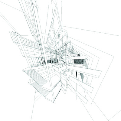
(The Blur, Diller + Scofidio for the Expo.02, 2002, Yverdon-les-Bains, Switzerland; via: http://www.eikongraphia.com/)
The reason one has refer to very particular examples is, that the greater narrative has not been written yet and the small innocent examples can hint us at how to understand and begin to comprehend, what a fundamental change the internet and digital technology is. The digital natives are users of applications and highly designed tools, that are either tools satisfy individual desires and/or problems, or they offer a critical hybridization of not too many — but just enough — elements to maintain a simplicity of usage. This hybridization, inherent in smart phones or in particular the iPhone, is a manifestation of said hybridization. But in fact that does not mean anything else than networking/network-ability of single elements/tools that start working together as a compound entity (in other words a network, or straightforward the internet itself). The iPhone thus becomes an (hardware) extension of the internet so to speak. The digital natives are continuously using more such highly developed tools. The simpler (and easier, but at the same time cleverer!) the networked elements work together, the faster will they be adopted and used in favor to older, less networked tools and applications (-> AppStore).
This development in which the digital natives are immersed in, the previous generation is experiencing with a tad less immersion. The competence of using such networked tools is very high with the digital natives. Pretty much any pre-kindergardeners will without much hesitation take an iPhone and figure it out how to use it. It is interesting to observe an adult talking to his child, about having to install an app so she can play the piano on the iPhone. What an absurdity of abstract terms one might think, but in context and considering the level of immersion of the digital natives, such technological concepts and terminology one does not need to know about , in order to be able to use.
The cleverly networked and designed tools reduce knowledge to a negotiation of intuition in order to allow a smooth adaptation.
Now the previous generation firstly had to deal with inferior digital tools, that where far less intuitive and the "learning curve" was very difficult to master. Hence only a very few achieved this level of mastery and immersion exactly because there was no precedent. These individuals where exactly became the precedent for the digital native. A very elite part of such people where the early hackers, mostly benign in nature they simply spent lots of time working their way into this digital realm. Intuitive design of digital tools, simply means that they are accessible, they are open to use in manifold ways. Such doors the hackers had to find for themselves, they had to hack (type into the computer) a program, and application because there simply was none before. Obviously by far not everybody has been a hacker of the generation avant the digital natives, but surely the competence in terms of how the digital technology is made, comprised and how it works is higher, than simply knowing how to use it.
Professor Rolf Pfeiffer of the Artificial Intelligence (AI) Lab at the University of Zurich is researching toward the intelligence of the limbs. Contrary to Prof. Pfeiffer's research, in Japan for instance, robots as an application of artificial intelligence are centrally controlled by a computer, that steers all its functions, similar to our brain. However Prof. Pfeiffer argued and research in Biology has shown, that our brain in fact does not control every process, but certain reactions are subsidized, locally induced. His argument is that nowadays hardly a computer can achieve both, miniaturization of the computer and it's computing power can be combined in order to centrally command a robot it all it's complexities it is supposed to mimic human behavior - be artificially intelligent. Thus Prof. Pfeiffer breaks down the intelligence. How a limb is designed impacts it's function, thus less computing power is needed.
I am not an expert on AI research, but at least as a metaphor it could have value to my argument. The cleverly networked tools the digital natives use demand only a little intelligence to understand how they work, we can interact instantaneously and thus focus our intelligence on actually using them. The design is intelligent, thus we can relocate knowledge and intelligence to other things.
I have mentioned two generations, the digital natives, born at the end of the eighties to pretty much nowadays and beyond and the previous generation.
Where the latter had to painstakingly y acquire the competence in using digital technology, the former is immersed in digital technology that offers a plethora of intelligently designed (cleverly networked) tools and thus can focus on the application than onto "howto".
This rather long excursus should not have been in avid, but rather important to get to the next point. People in politics and those who are in charge of our societ(-ies)y are predominantly of that previous generation or even older ones. The consequence is, that the general understanding on what a profound meaning the internet has is fundamentally lacking. The questions that should be driving us, in order to understand what the immersion of the digital natives means and in more general terms the ubiquitous availability of information. Current developments in computer science and information technology are working with the notion of the "could", cloud-computing. Where information is no longer stored locally, but in the cloud, the internet. Much more than just a reiteration of the net-computer that Sun was advertising in the 1990's, this similar concept describes the cloud as omni-present entity, where I can access my stored information anywhere and anytime. Ubiquitous computing becomes the ubiquitous information, which is instantaneously available. There is only one precedent which comes to mind to this concept, our brain.
If you as a politician or policy maker have only a faint understanding and a vague notion what the digital and the internet is, how should you be able to define digital politics (policy, DIgitalpolitik)? How can you address such problems such as the digital divide? I think there is a cultural disconnect, which is unfortunately is difficult to describe and to anticipate how it will develop, except that it will further effect everything we do.
Certainly it is an important question to ask, that we perhaps should not offer all of our private information, that the government should not save our patient data on the internet. But what is the notion of privacy in a time, where the digital natives do not care firing away personal information on the internet. On the contrary, the information you disclose, the better will you be networked and the smoother applications work, individualized and adapted.
Such concepts and arguments can be repeated about pretty much everything, it seems we have to renegotiate everything.
This is neither solely a phenomenon at the end of industrialization, nor a contemporary sideshow. I would boldly suggest, that this hints at a new culture. Its locus is the internet,the cloud is too hard to locate, but ubiquity suggests placelessness.
March 09, 2010
VitraHaus by Herzog & de Meuron
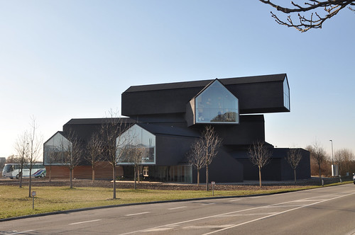
Yesterday I visited the VitraHaus which was designed by Herzog & De Meuron in Weil am Rhein in Germany, next to Basel.
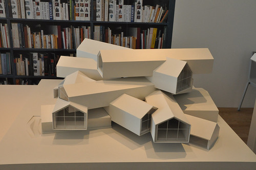
The design features stacked logs that are shaped like long houses.
You can find some 200+ images on my flickr site.
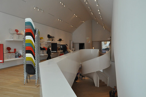
The appearing simple gesture of stacking results in a fairly complex spatial sequence of rooms, each representing a house of their own. The buildings programme is to house the furniture factory Vitra's showroom of available furniture, especially their signature design stools and chairs, hence the building is called VitraHaus (house). The upper three floors and their mezzanines function therefore as galleries with a distict hous-y and cozy feeling, each of the floors, respecitvely houses, has a large glazed front looking at the surrounding landscape and Vitra factory. The ground floor houses Vitra's design museum shop and a café. Once the potential customer has been equipped with a personal card that allows one to access data on the furniture all over the house on interactive panels, you go to the fourth floor and then walk down through the various houses via spiraling staircases.
The building is located on the sprawling Vitra campus, which hosts the Vitra Design Museum and the Vitra factory. Vitra has comissioned architects since the 1980's to design factory buildings (Alvaro Siza, Nicolas Grimshaw, Frank Gehry), Galleries (Frank gehry and now H&deM), a conference center (Tadao Ando) and a fire house (Zaha Hadid's first built project). This year a new factory building by Sanaa will be unveiled.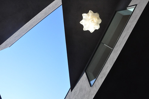
March 01, 2010
EPFL Rolex Learning Center by SANAA

Please find images of the building's outside and inside on my flickr page.
Last week I visited the Rolex Learning Center at the EPFL in Lausanne in Switzerland. The building designed by SANAA, the firm lead by Kazuyo Sejima and Ryue Nishizawa, was just opened February 22nd 2010.
The EPFL, the Ecole Polytechnique Fédérale de Lausanne is a second campus of the ETH, Eidgenössische Technische Hochschule, which first campus is in Zurich.The ETH and EPF are associated as both are a federal school (Institution of the country Switzerland), the aditional letter signifies the particular city (ETH-Z for Zurich and EPF-L for Lausanne), but the two campuses still function as separate universities.
The lausanne campus, founded in the 1950's, was vastly growing the last decades, where the Rolex Learning Center marks the latest addition. The building is located on the southern edge of the campus, with the Lake Geneva and the french alps as a beautiful backdrop, and is entirely open to public from early in the morning to late at night. The building's title refferes to the collaboration and sponsoring of Rolex, which goes back many years, hence the previous learning center was inside an existing building on the campus. The increasing demands of flexible and representative working spaces, ever evolving technology and adequate infrastructure lead to the competition for a new building, which SANAA has won.
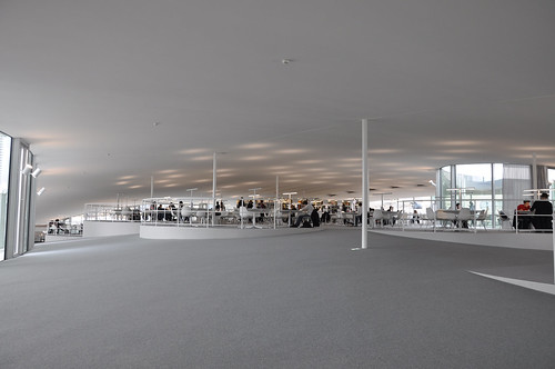
I was very eager to go visit and see this particular building. By the rather overwhelming outcome of that competition, not only referring to SANAA's scheme but also for instance H&deM's, it is fair to say that one was anticipating a finished building not short of being spectacular. But I suppose such a notion wouldn't do justice to SANAA's minimalistic and to a degree humble designs, therefore considering my anticipation I was underwhelmed. Nevertheless, I think that is a good thing and perhaps illustrates why frankly I think the building will be a huge success. "The continuos slab", as a Japanese friend has put it, has again a very modest appearance of an one story high office. Once you pass by the arching slab, which gives way to the ground floor vaulted outside spaces, leading to the single holes (cut-out's) of the building, that previous mentioned modesty gives way to a overwhelming feeling below soaring arches of some of the most beautiful concrete work one can buy.
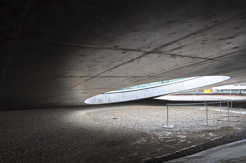
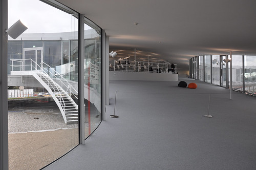
Whilst being generally a somber space, with the occasional hole shedding light, the somewhat fine concrete reflects large amounts of light, creating somewhat of a serene beauty. Still these spaces are directly contrasted by the white in white and some grey of continuous space inside the slab. While it is perhaps difficult to imagine to orientate in such an environment, it is on the contrary rather simple and after a few minutes the visitor gets a general sense of what to find where, which is mainly the restaurant, the library, the auditorium and administrational offices. The connecting spaces are all laid out with chairs, tables and on sloping areas with cushions offering a broad variety of working spaces for the students.
The buildings design of this continuous strata offers no Loos'ian qualification of marking spatial importance by varying heights, however the sloping surface offers literal highlights, such as the library, a served restaurant and an auditorium. These spaces slope up to some 3.5-4 meter height, offering the possibility to pass underneath in the outside. Public buildings in Switzerland have to be accessible by all and hence access for disabled had to be included to master some of those slopes. Two elevators sliding along the slope are installed, as well as three meandering paths to maintain a 6% slope. Additionally one vertical elevator pierces through the building and connects all levels, even the parking garage beneath. Additionally a pathway system for blind has been installed, similar can be found in Switzerland for instance on train stations.
While the fixed areas of the building only amount to a small meterage, a large amount is circulation area, that is flexibly programmable, some areas however defy any programmatic logic and therefore only can be used as remote and therefore calm areas where students can meet and gather on those comfy cushions. Structurally however, such a remainder of the square shaped building's form is important to enclose a hole and support the arches, also including an emergency exit.
I spent probably three hours walking inside and outside the building. The former is fully functional and was used a lot on a friday morning by students and some visitors exploring like myself. The students where happy to fully occupy the building and it's learning landscape, distributing themselves into and onto the various areas and configurations of work spaces. The library and restaurant where also fully inhabited and the building seemed to be running smoothly. The outside however is not yet fully open, red carpet on some wooden planks lead to the entrances until the landscaping has been finished.
The Rolex Learning Center is like aforementioned, a large library with space for the students to work and learn. trying to categorize and compare this building to other, i think it does offer a particular amount of flexibility needed to be a modern building, while maintaining a formal language that emphasizes it's inimitability, as a modest signature of sorts. In a historical context, this building should be regarded as a mat-building, but that is for a later post to discuss in detail.
Concluding I would say, that the underwhelming exterior perhaps help to hide the experience within and it does therefore fit neatly in the line of work of SANAA and their minimalistic modernism, but more importantly it's exterior modesty helps to acquaint the context with the building - meaning the reception of the Swiss and the local user. The overwhelming interior is therefore less antagonizing, beside being beautifully executed. I am very satisfied with my experience and I congratulate SANAA and their construction partner's (Losinger et al.) design intelligence to this wonderful piece of work. Last I think it's commendable how the building's interior has been assembled, because like always there have been certainly design compromises in order to make it work, but I think a viable and successful solution has been put forward, especially in such a context of a difficult building.
Further images and information below.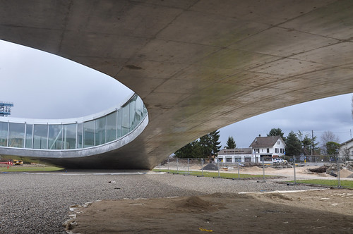

Further Information:
The EPFL's website on the Learning Center and the
Rolex Learning Center's own website featuring a movie and explanatory information about the building and the architects.
Designboom had a feature in February with detailed information on the building's construction method and other technical details, I very recommend browsing by.
The Learning Center even has opened a youtube channel, featuring a movie with interview experpts of the university's dean and SANAA. See the movie below:
February 15, 2010

February 12, 2010
Reconstructing Metropolis

The Berlin Rundfunk-Symphonic-Orchestra, © Reuters
There are perhaps not many architects, who are unaware of the German movie classic from 1927 METROPOLIS by Fritz Lang. Following the image of the industrious Berlin of the golden twenties and the ongoing expansion of the New York skyline, Fritz Lang created a dystopian city, merging elements of both and projecting it into the future. An immense city, with soaring buildings, connected by sky bridges and trains and plains navigating in between, that has a very dark side. The class society, similarly to Engels in his writing about the industrial poor in Manchester, has enslaved workers in underground factories, while the soaring heights belong to the upper class. An emerging struggle of power is unfolding by a workers' rebellion and a demonic scientist with his instrument a female human machine.
Those who haven't seen this film, will surely recognize many elements, since it's iconic vistas have found there way into many science fiction films in the following decades, one might even argue it defined and even created entire film genre.
The story about the movie is as interesting as the story within the movie. A quarter of the movie was presumed lost since it's premiere on January 10th 1927 in the Ufa-palace at the Zoo. Therefore it was quite a surprise announcement in 2008, that 16mm negatives of the film have been found in Buenos Aires.
The following restoration was able to add 30minutes to the film, which adds up to a total length of 147minutes.
According to martin Koerber of the Stiftung Deutsche Kinemathek Metropolis still has lacking pieces, but the missing quarter has almost entirely been added.
To celebrate this classic of silent film at the Berlin Film Festival, the Berlinale, Metropolis will be premiered once more at the Friedrichstadtpalast in Berlin and at the same time at the Alte Oper in Frankfurt am Main, accompanied by symphonic orchestras. In Berlin an open air performance was announced to be held at the Brandenburger Tor.
Eberhard Junkersdorf, head of the Murnau-Stiftung which administers the rights of the film, described Metropolis to be great cinema which is as topical as 83 years ago, a brilliant critique of capitalism.
For those who don't happen to be in Frankfurt or Berlin I reccomend to watch tonight 20.15 either ARTE or 3SAT, or see the performance online: Livestream.
Via:
NZZ
Protagonists:
ARTE & 3SAT
Rundfunk Symphonie Orchester
Trailer
May 11, 2009
ARCHITEKTUR MUSS BRENNEN

Flammenflügel | photo by Coop Himmelb(l)au
image source | 1980
Wie beschissen die 70er Jahre waren, kann man auch aus den ver-
klemmten Architekturprojekten lesen.
Die Umfrage und Gefälligkeitsdemokratie lebt hinter Biedermeierfas-
saden.
Wir aber haben keine Lust, Biedermeier zu bauen. Nicht jetzt und zu
keiner anderen Zeit. Wir haben es satt, Palladio und andere histori-
sche Masken zu sehen. Weil wir in der Architektur nicht alles das aus-
schließen wollen, was unruhig macht.
Wir wollen Architektur, die mehr hat. Architektur, die blutet, die er-
schöpft, die dreht und meinetwegen bricht. Architektur, die leuchtet,
die sticht, die fetzt und unter Dehnung reißt. Architektur muß schluch-
tig, feurig, glatt, hart, eckig, brutal, rund, zärtlich, farbig, obszön, geil,
träumend, vernähend, verlernend, naß, trocken und herzschlagend
sein. Lebend oder tot. Wenn sie kalt ist, dann kalt wie ein Eisblock.
Wenn sie heiß ist, dann so heiß wie ein Flammenflügel.
Architektur muß brennen.
© COOP HIMMELB(L)AU, ARCHITEKTUR MUSS BRENNEN (1980)
"OMA/Koolhaas' CCTV" | photo by Alfred Cheng/Reuters
image source | via archidose | FEB 2009
Zaha Hadid's Guangzhou Opera House | photo by 史大林
image source | via Kazys Varnelis | MAY 2009
April 12, 2009
Peter Zumthor is awarded the Pritzker Prize 2009

updated_11.50pm_13042009
Peter Zumthor, renowned Swiss architect, was awarded the Pritzker Prize 2009. After having received the Praemium Imperiale in 2008 awarded by the Emperor's house in Japan, he received now the architect's profession highest honors.
Quote from the New York Times article:
“He has conceived his method of practice almost as carefully as each of his projects,” said the citation from the nine-member Pritzker jury. “He develops buildings of great integrity — untouched by fad or fashion. Declining a majority of the commissions that come his way, he only accepts a project if he feels a deep affinity for its program, and from the moment of commitment, his devotion is complete, overseeing the project’s realization to the very last detail.”
The project Peter Zumthor is probably best known for is the alpine spa and thermal bath in Vals in Switzerland and the art museum in Bregenz, Austria. Recently finished were the Bruder Klaus chapel in the rural landscape outside Mechernich between Cologne and Bonn in Germany and the Kolumba, the diocese art museum of Cologne.
More information to follow.
Source:
New York Times
More info:
Pritzker Prize 2009 Laureate @ Pritzkerprize.com,
also Photobooklet (pdf) and Textbooklet (pdf)
Interview with Zumthor @ Chicago Tribune
Washington Post
Articles and critiques on Zumthor's projects @ NZZ (german)
Kunsthaus Bregenz, Kolumba, Bruder Klaus Kapelle, Oblomov Stagedesign
On teaching by Peter Zumthor
Images:
I am currently uploading images of the Kolumba, the Burder Klaus chapel and the Bregenz Museum onto my Zumthor Flickr Set, so check back!
November 10, 2008
Chipperfield to build new Kunsthaus in Zurich
David Chipperfield has been announced as the winner of the international competition to design an extension to the Kunsthaus (art museum) of Zurich, Switzerland. 214 architecture offices from 22 countries were taking part in this competition. As usually in Zurich only the architect has been announced yet, images and more information is yet to be published at a press conference in December. According to the press briefing, a large majority of the jury voted for Chipperfield's project, which is supposed a "classic Chipperfield".1
update
Further information, along with images and plans have been scheduled to be published in December, but according to the Kunsthaus Zurich some unauthorised images were published which only show an early design stage.
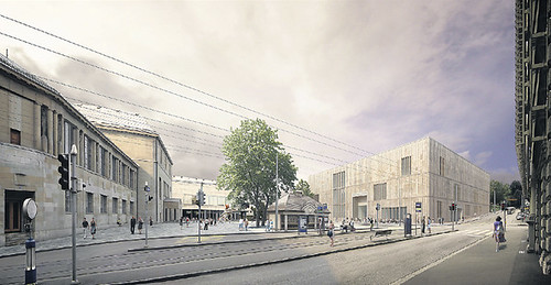
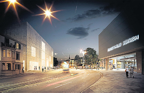
The NZZ describes it as an "unfussy and straightforward art-palazzo without 'starchitect'-allures, an almost Protestant sobriety, austerity and modesty suiting a Zwinglian Zurich" (sort of similar to the Calvinistic Geneva, for the uninitiated).
However the first of the two images shows indeed a very subtle addition that creates somewhat of an ensemble with the existing Kunsthaus building, with similar materialization and color, yet maintaining a certain autonomy. It clearly shows the architects sensibility by the treatment of the situation. Rethinking the Heldplatz as a "Platz" rather than a mere agglomeration transit ways and an infrastructural node, would allow it to become a counterpart to the Bellevue, further towards the Opera house, and a central location for the Hochschul- and Museumsquarter - although this hasn't been part of the competition I do think the city will have to give it some serious thought.
Contrary to perhaps future projects in Basel or existing ones in Lucerne, pushing larger and important buildings in Zurich has become increasingly difficult in the last twenty years, resulting in a number of projects but most of which ultimately disappear. Like the congress center at the lake by Rafael Moneo which didn't survice a public vote on the project. This results in a complete lack of so-called 'icons', e.g. the KKL in Lucerne by Jean Nouvel and similar projects elswhere in Switzerland (of course except perhaps some "older" ones representing a newly found conscious of the city when the federal state was established some 150 years ago; but those buildings, for instance the ETH by Gottfired Semper, had a different relevance and reception at the time)
I guess it is too early to judge solely on two images, but besides that the NZZ got all excited about the Chipperfield's understatement, I am rather hopeful that perhaps this austere appearance will be a good choice for Zurich, at least one that will be accepted by the public.
The building will cost an estimated 150Mio sFr. and should be finished by 2015.
via:
NZZ, "David Chipperfield soll das neue Kunsthaus bauen", 08.11.2008
via NZZ, "Schnörkelloser Kunstpalazzo", 10.11.2008
via 2 "unauthorised images" reaction of the Kunsthaus [PDF], 10.11.2008
Images © of David Chipperfield Architects
October 11, 2008
Libeskind's Westside shopping center opens in Switzerland
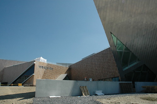
View from north of the outside of the new Westside shopping center, designed by Daniel Libeskind.
updated
Introduction
The Westside shopping center in Brünnen, a part of the city of Berne (the capital of Switzerland) , opened it's gates this weekend.
The project was started 2000, when Daniel Libeskind won an international competition to design the shoppingcenter. Construction did not start until 2006.
The complex not only features a shopping mall, but also a conference-hotel, a cineplex, elderly people housing and a spa.
The whole development at the western most part of the city of Berne will complete a dense housing development started in the seventies and when completed will offer housing to additional 3000 people.
The shoppingcenter is said to cater an area with around 1.2 Million people sourrounding the city of Berne.
More images in my
flickr-set of the Westside shopping Center.
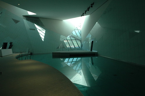
Inside view of the spaa and pool-area, designed by Daniel Libeskind.
View from north of the outside of the new Westside shopping center, designed by Daniel Libeskind.
A critique?
A friend of mine (until I have verified if I am allowed to name him by name) asked me the following question regarding this project:
"Working on a critique, hah? This project seems to me like an extinct scenery for young people: where do the physical presence of elderly people and shops benefit from each other in an experience that claims to be "more than shopping"? It's very admirable to think of elderly people in a project at this scale, but then please tell me, why isn't the whole building capable of wheelchairs etc.? You should actually add that this building is a hoax.
Copy/Paste-ing previously used formal concepts (Jewish Museum, Berlin) to in terms of space and culture totally different locations on the globe is just not the way to do it. Sorry, Mr. Liebeskind."
Additional programming of building
Well isn't it? A building this large, with an Gestaltungsplan for a large part of Brünnen I suppose there were requirements to be wheelchair accessible, I didn't see any barriers or too narrow places on the contrary. This part of a "Mantelnutzung" around the actual shopping part of this complex is nothing particularly new, think of the Joggeli (St. Jakob Stadium) in Basel. The Brünnen AG, who planned the shopping center and the adjacent housing projects, a subsidiary of Migros was even required to add such an amenity by the the city of Berne.
First and second, it's no secret that our society is aging and soon you will have quite a number of people beyond 60 years of age and much older. So how do you face this challenge, actually quite a number of small towns in Switzerland have begun recently to plan and even build Housing for elderly people, often in the town centers, because of exactly this increase which won't happen some time in future but is already happening.
Third, relocating the concept of a mall from the US to Switzerland will ultimately fail if it's not adapted. Interestingly enough the first Swiss mall, the Glattzentrum planned in the sixties, was actually the first of such malls after the American example that was built in Europe. Generally speeking such places in Switzerland, Tivoli, Glatt, Sarganserland etc. pp. are mostly conglomerate of a broad variety shopping functions added over time, meaning you have a conglomerate of building creating a fictional mall-like-experience.
However, the context of Westside is a bit different. Located at the westernmost part of the city of Berne, actually already placed in the Landschaft and not inside the city, the term periphery here could be only applicable to the city itself and not to the "Agglomeration" of Berne, since it's still on the territory of the city.
Why I am making this painstakting distiction is, because exactly that will show us, wether the urban concept and planning will utimately fail or not.
See, at Brünnen you had those housing developments in Corbusier-like fashion that were built in the sixties and seventies. Eventually with this additional planning, which has been in the works since that time but was never realized, you will actually receive a densification of this part of Brünnen/Berne. Adding another 3000 poeple may not be much, but for Brünnen it is.
I suppose having a mixed-use planning would be the first stage or a potentially successfull planning. Also bear in mind that a single Shopping building probably would not generate nearly enough visitors, that's why a spa, cinema and hotel have been added, along the elderly housing.
That all generates traffic and a public (Öffentlichkeit), the additional concept that the ground functions are all walkable and that the area towards the housing area are all car-free might suggest, that it is intended to generate a Stadtteil, rather than a retail outlet, which it is of course.
A spatial separation between housing and shopping is still maintained, and the vertical integration and superposition that perhaps Christiaanse preaches is not implemented.
Considering all this, one still might be cautiously positive about the future development of this area.
The Architectural design
Regarding the visual language, you're right to a certain degree. See, it is my utmost belief that buildings and such complexes should be designed by architects because there is additional value (Mehrwert) that solely developers can't achieve, because how the user feels and interacts inside the building cannot be planned with just efficiency or cost-engineering.
Inside I think, and critiques have shown that I suppose, the shopping center is quite a success, because the rooms are spacious, light and fairly attractive.
(In the context of Brünnen you could argue that the complex takes up the role of the Agora, but that would lead to far and is a whole other discussion, especially because Postmodernism is all about internalising public space, shown with that downtown-hotel in Los Angeles, that was one of the first, featuring a huge multi-purpose lobby)
Outside, on a detail level, the visual language is very appreciable, even the layering and positioning of the volumes is interesting and offers enough complexity.
But with architectural style, particularly with such of one architect, where he/she has developed a visual style that continuously gets repeated on various buildings might pose deeper problems. The problem is, what is exactly this style, are those visual elements that you adapt from one project to another or perhaps only a method that somehow leeds to similar output, because e your mindset works in a particular way.
My intention is not to rationalize the language best seen at the Jewish Museum in Berlin, U agree that ultimately such elements become merely a visual reference to something else, the signified elements have been totally detached and therefore you only get a codified image, index and are not able to reference it to something meaningful, without just creating a visual complexity enriching a façade.
May 13, 2008
HOSOYA SCHAEFER Architects (Part III) - Partnership Smartinska in Ljubljana

Well Hosoya Schaefer Architects have done it again: Only within a few weeks since the office last announced they won the competition of the Engadin Airport, now they have won the competition for a masterplan in Ljubljana, Slovenia (EU).
Read the press release:
"HOSOYA SCHAEFER ARCHITECTS win 1st prize in the urban design competition “Partnership Smartinska” in Ljubljana, Slovenia.
May 5, 2008:
The Chamber of Architecture and Spatial Planning of Slovenia (ZAPS) has announced that Hosoya Schaefer Architects won the first prize in the urban design competition “Partnership Šmartinska”. The task was to create a masterplan for the redevelopment of 230 ha in Ljubljana. This strategically important site in Ljubljana stretches from the central railway station to the highway ring and, among other areas, includes BTC City, one of the largest retail developments in Europe. The winning proposal was developed in collaboration with Space Syntax, London and Wüest & Partner, Zürich.
At the heart of the proposal is a triangular central park of 7.4 ha. On its north side a new boulevard transverses the entire site. It is the infrastructural backbone and main organizing element of the redevelopment area and connects it to the central station and the city center. While it is to long for pedestrian flows over its entirety, it contains areas of interest that induce pedestrian traffic: The BTC Boulevard is the pedestrian axis for the BTC retail area with BTC Plaza as its main focus. The proposed Central Park is the green heart of the entire redevelopment area. Kolinska Square is the new entrance to the quarter and acts as a cultural and commercial attractor drawing visitors both from the center and the surrounding neighborhoods. Larger distances can be traveled by tram that runs on the boulevard from the central train station to the outer ring.
The proposal is based on two different urban patterns and their associated functions: the extension of the city fabric with the clarity, accessibility, flexible program mix and long life cycle of its main typology the perimeter block; and the extension of the BTC area with its generous spaces, large volumes, ease of movement (albeit at the moment mostly by car) and shorter building life cycles with high commercial returns. The proposal aims to strengthen the existing qualities of the two patterns and connect them to a larger whole. It allows for mixed use on large and small scales and the subsequent development of urbanity around a variety of new places and program clusters.
Principles of sustainable urban development have been applied both on the level of spatial layout as well as infrastructure and have been proposed for building requirements. The phasing strategy proposed implements the strategic elements first. Various scenarios can unfold and the typologies proposed are flexible. The plan can also be operative when only executed in parts as long as the urban network and armature are implemented.
About HOSOYA SCHAEFER ARCHITECTS
HOSOYA SCHAEFER ARCHITECTS is an international practice for contemporary architecture, strategies and research based in Zürich, Switzerland. Hiromi Hosoya and Markus Schaefer founded the firm in 2003. The firm won a ContractWorld Award 2008 for their first realized project, a restaurant built for Autostadt, the theme park and communications platform for the Volkswagen Group in Wolfsburg, Germany. Recently, it won the first prize in the competition for the new airport building at St. Moritz – Samedan in Switzerland.
Current projects of the firm include a new building for the La Rinascente department store (14,000 m2) and an office building for Risanamento Spa (27,000 m2) in Milano Santa Giulia in Italy. Both Hiromi Hosoya and Markus Schaefer are currently professors at the Academy of Fine Arts in Vienna, Austria."
End of press release.

This sounds very interesting and of course we are curious to see more images and plans of the scheme also to be enabled to make an opinion for ourselves of the project. Nonetheless there are two things I should mention. Firstly Hosoya Schaefer Architects teaming up with Space Syntax and Wüest und Partner, two consulting companies. Space Syntax developed at the University College in London a "computer-based modelling technique to treat cities and buildings ‘space first’, that is as the network of spaces we use and move through." (1) This seems to be like a more detailed and localized version of the MVRDV Regionmaker. Wüest und Partner on the otherhand, a rather huge player in real estate onsultancy in Switzerland with lot's of know-how particulary regarding estimation and developemt of and on the economics of viable real-estate, residential and multi-use (sounds like a tag-line). These partners and the press release might suggest a very pragmatic and differentiated approach on structuring such a huge site to garner a certain critical size.
The other interesting aspect is, that Hosoya Schaefer Architects, particularly Markus Schaefer, are no strangers to Ljubljana. He has tought together with Marijn Spoelstra a research and project semester on Ljubljana at the Berlage Institute in 2006/7 called "Light Capital: Urban Scripts for Ljubljana" (find a description here) which was also featured at the Venice Biennale.

Images © HOSOYA SCHAEFER Architects,
More Images and info, with project credits: here
April 28, 2008


April 27, 2008

March 14, 2008
Yahoo moves European base to Switzerland
Zurich has the European headquarter of Google and the region of Geneva will have the new European headquarter of Yahoo.
Who's next?
via
btw: sfr is now of higher value than $...
Subscribe to:
Posts (Atom)

